Houdini UI Needs to Change

   16445   180   4
User Avatar
Member
34 posts
Joined: 8月 2024
Offline
LukeP
For me - I love the new look. I don’t want to go back and get opinion as honestly don’t think the two people I know can / should be seen as the UI experts either. I just wanted to pass in their comments in the earlier post. Thank you for doing this and mocking up this what could be the new look.

This was more of a gag . But thanks for your appreciation, I just want to have a talk about Houdini's UI situation, it's fun for me and hopefully it will be food for thought for someone at SideFX.
User Avatar
Member
379 posts
Joined: 4月 2018
Online
Great mockups. Appreciate the effort of actually translating your thoughts about the UI into actual images. I think it looks great. I'm personally not a fan of the skeumorphism in Houdini's icon design, even though moving away from that would mean losing out on gems like their Illegal Pixel COP(ernicus) icon, that is literally an image of a pixel dressed like a bandit, holding a freaking gun.
Edited by eikonoklastes - 2024年8月28日 02:54:00

Attachments:
2024-08-28_10-53.png (11.4 KB)

User Avatar
Member
34 posts
Joined: 10月 2022
Offline
Whoever designed the Houdini icons has a great eye.
Seriously, who is that guy? He's an absolute legend!
God, I love Houdini icons so much!
User Avatar
Member
133 posts
Joined: 8月 2010
Offline
Is that the guy doing ALL of the houdini UI design?
Edited by aeaeaeae - 2024年8月28日 05:12:55
B-System for Houdini [ae43ae43.gumroad.com]: instance editor, blender like interface.
User Avatar
Member
105 posts
Joined: 6月 2020
Offline
ruffemotion
I've made some mockups of my dream version of Houdini UI and I was hoping to talk a little about them with you

I can definitely appreciate the effort that went into making this mockup and it does certainly look really good! However I feel that this style of design would only hurt productivity. Houdini is a tool afterall and it's more important (imo) to quickly know what and where to click rather than aesthetic appeal.

Even just comparing the different node designs; with the current look I can easily distinguish between obj nodes, sop nodes, and specific types like nulls, volumes, filecaches etc. Compare that to the mockup where they all look the same and it takes longer to digest what I'm looking at. I can't imagine opening another artist's production setup with thousands of black, identical looking nodes...what a nightmare!

Remember when Maya switched to a "modern" flat UI design and all of a sudden it became just a bit more annoying tell the icons apart?
Remember when Windows did the same? Weird that they've ditched that and moved back to a UI with more distinct visual cues.

I’d prefer Houdini’s UI to prioritize functionality and productivity over aesthetics.

Again, I think your mockup looks really great, you obviously have an eye for design and I don't want to downplay your effort. I just think that when I comes to software there has to be some sacrifice of beauty for usability and Houdini already does a pretty good job at that. I think even just bringing the node shapes and colors back into your design would help alot!
User Avatar
Member
34 posts
Joined: 8月 2024
Offline
freshbaked
I’d prefer Houdini’s UI to prioritize functionality and productivity over aesthetics.

You're another person who assumes that UI Design is just about aesthetics. By the way, if you look at anything other than nodes, then you'll notice that I've changed quite a bit, but let's leave it for now.

Let me state this once and for all, so just my position is clear: UI design doesn't mean just to make the it look pretty, it's more like a professional cleaning and organizing of a cluttered workshop [www.erinspain.com]. It involves streamlining and making the workspace more efficient, where all tools are easily accessible, logically organized, labeled, all of the garbage is taken out. All this while taking into account and respecting various ways in which this workshop has been formed & used over the years.

Here's what I think like: if there's a problem — find a solution. And then we can evaluate it together.

I didn't realize that it's that important to tell apart nodes like that, I thought the icons took care of that. So, original SideFX people solved this problem by using shapes, like you mentioned. And so if we boil down the requirement to simply distinguish between sops, dops, etc. at a glance, then wouldn't it be better to say explicitly which one's which? Instead of some confusing abstract shapes. It would be better for newbies too:
Edited by ruffemotion - 2024年8月28日 13:08:51

Attachments:
5MlmgJN13d.png (8.6 KB)

User Avatar
Member
211 posts
Joined: 12月 2009
Offline
Imho, your mockups are highly eye pleasing and I personally would love to give these changes a try in actual projects.

If I had to choose, I would vote for UX improvements and tidying up the interface, improving the layout of the parameter pane and things like that, first.

But I can totally see the potential for greater acceptance by new users and designers (aka humans that are distracted by mediocre looks) if the UI could be a bit sexier and less inconsistent. For me, a broader set of curated (!) color schemes sound like a first start in this direction.

To please everybody, houdini should have a skinnable UI with different (easily customizable) presets. With presets like classic, minimalistic, sci-fi and what not. The actual implementation should be platform agnostic, of course. The question is, how much time/resources sesi can/wants to spend. This task is not an easy one, imho.

Of course there're downsides with changes in UI as well: screenshots in the documentation, tutorials, books and other media wouldn't match with the actual look of the interface anymore and need to be updated (expensive) or would remain old. So, new users could actually struggle diving inside houdini with this kind of mismatch. But, wasn't attracting new users one of my stronger arguments for changing the UI, in the first place ..?

The more I think about it, I can understand, why sesi didn't rush working on UI changes since years.
User Avatar
Member
34 posts
Joined: 8月 2024
Offline
bollili
I personally would love to give these changes a try in actual projects.

That would be the most valuable feedback, for sure.

bollili
The more I think about it, I can understand, why sesi didn't rush working on UI changes since years.

Yeah I understand that too, I didn't say the transition wouldn't be painful (mostly for SideFX) -- a lot of stuff to worry about and tons of work. And the more the time goes on, the harder this inevitable transition will become. And that's all the more reason to start this UI Overhaul project ASAP, by the way. All I'm saying is despite all that -- I strongly believe that all these efforts would be worth it in the end, for everyone.
Edited by ruffemotion - 2024年8月28日 14:38:43
User Avatar
Member
34 posts
Joined: 8月 2024
Offline
eikonoklastes
I'm personally not a fan of the skeumorphism in Houdini's icon design, even though moving away from that would mean losing out on gems like their Illegal Pixel COP(ernicus) icon, that is literally an image of a pixel dressed like a bandit, holding a freaking gun.

Attachments:
WDkOoe3r55.png (110.9 KB)

User Avatar
Member
390 posts
Joined: 11月 2008
Offline
Hi, nice mockup. Catchy at the first look, resembles Zbrush/3d coat/Blender, but hard to judge without seeing it in action/at different scale/zoom levels and in details of other contexts.

There was few UI redesigns/updates in Houdini already and from what I can see it is continuous process. While we do get some new look/style and useful features, it also means we did lost some old (useful) ones.

Few objections for your design mockup:

Camera selector at the bottom:
  • Different from almost every other DCC, makes switching difficult (especially for users who use multiple DCCs)
  • Long distant from other elements. It's one of the most important feature when working on shot work if I'm looking from correct camera and if it's locked or not (there is lock icon next to "sun?" icon. There is 3d viewport in left top corner, but Perspective and No Camera in bottom right.

Floating toolbar icons in viewport:
  • I like the floating icon concept (to see more of the viewport behind)
  • But I'm willing to sacrifice that if it means any performance degradation.
  • Layout/grouping of the icons make no sense.
  • Without colors it's hard to navigate what icon is what
  • Two columns of icons with sub-menus. How/where do they open? This is problematic when left button's submenu covers right button and vice versa. I already have the same problem with current (new) nested multi column layout in tab menu.
  • I would like to see the floating viewport buttons/toolbars semi-transaprent when not on hover (we have it kind in new HUDs but these are far from ideal, and I'm afraid there are at the limits of existing Qt designs).
    Maybe that's the future of the viewport GUI buttons/toolbars: to have custom buttons in floating HUD layout and user could pin them wherever they like?

Transparent toolbars:
  • I thought you have transparent toolbars, but from node editor it's clear that they are not. That would be nice to have to complement floating buttons in viewport.

Lack of colors:
  • While it monochrome design with very few accents looks "stylish" the usability is somehow lower (unless you are colorblind).
  • Although, I would like to have an option to toggle colors on/off to this kind of style (monochrome with single/limited accent colors) when I prefer not to be distracted. (Similar way how we can switch dark/light theme/ viewport background).
  • I'm curious how much you can "skin" Houdini already to this look. (As we can already adjust most of the colors, not sure if we can easily swap icons too). Would release your icon set?
  • The accent is quite strong (intense) to my taste. It takes too much attention (highlighted buttons/toggles burns into my eyes, when I'm trying to focus on the content of the viepwort - Try to zoom out and squint and focus on pig -> the orange buttons sparkle and drag attention away of pig).

Lack of colored icons:
  • Why single tone icons looks "stylish", differentiation only by shape is not enough. Good "bad" example is new Maya: its new toolbar icons have same color for similar type (polygons are all orange icons, when you switch to nurbs tab you get all blue icons). I have hard time to find the correct icon in that list of same colored icons each time. (It's objectively slower.)
  • E.g. Softimage XSI had a lot of elements with text labels only, and it had imho one of the best UI designs - very clear what the button does, very clear what context you are in. Buttons where in static, predictable locations.
  • In Houdini I like to enable coloring of the tabs based on context -> I can quickly we what panes is in what context.

Diamond shaped keyframes on timeline:
  • Takes too much space. Cannot see any benefit. Makes harder to stack multiple keys next to each other.

Lack of icons in tab menu:
  • Make's harder to differentiate the nodes/categories in tab menu
  • Alphabetical order vs context order… (I have already reservation to current redesigned tab menu in Houdini 20/20.5)

Dark nodes:
  • Swap the contrast focus on disable/inactive nodes - brings more attention to disabled/inactive/bypassed nodes than to active ones.
  • Vertical round corner flag strips - visually takes smaller area than slanted flat ones that makes it psychologically harder to point and click to activate them (even if the clickable area is could be same)

Shapeless nodes
  • There is option to enable "simplified shape" in Houdini already.
  • Shape (and node color) has important feature to differentiate areas in node graph, it also allows customization.
  • It helps to navigate graph at zoomed out levels.

Buttons instead of ring menu:
  • Worse design in different scale/zoom level.
  • Mistakable with badges

Context label next to node name:
  • All nodes in context have same type, and the context name is already displayed in the network editor.
  • Displaying node context type is superfluous clutter.

Lack of colored icons on nodes:
  • In the design, you need more space for the same node to show the icon.
  • Same as in "Lack of colored icons", it's harder to navigate only by shape. Color/texture/details are important indicator.
  • It might look good on paper (b/w) print. I can image in to have colorless icons as "simplified shape" option. But I'm not sure how much I would actually use it in real day to day work.

Parameter pane:
  • (Slow) animation is used for hiding latency issues (e.g. http reponse, loading level in game (downloading data)) or ongoing progress. There is no need for that in for displaying the controller. It's also not much connected to the cog icon (there is no transformation to justify the need for animation). So it only adds artificial delay to day to day workflow that cost time (and production money).
  • Offset (gap) from the edge is waste of space.
  • The font color is smaller? It's harder to read the values. The gap between fields/rows is huge.


How do you collapse/hide toolbars?

What is the "uv" badge/label next to the "uvproject1" node?

Why is the alembic cache node light gray?

Why is the "vellumsolver1" label green?
Did you put node colors on the icon+label instead of the node?

Why the wire color changed after "vellumpostprocess1" ?

How do you signal "disabled" buttons?


I would like to see:
Parameters pane semi-transaprent when not on hover.


I don't like the "modern take" that skeuomorphism is bad and everything has to be flat design with lack of color.
That's not design, that's art style. Design has to be functional in first place, otherwise it's not an design but an artistic expression.

The lack of gradients/color accents in some part of GUI has good reason: e.g. to avoid perception shift when evaluating picture, but applying it blindly everywhere we could easily go back to terminal and call it win.
User Avatar
Member
159 posts
Joined: 5月 2021
Offline
Too often people make something they would like and offer that up, but it is actually through collaborative group creative Design Workshops that produce great re-Designs.

The UI should be the very last thing and that is created from all the research into needs, wants, and dreams. It is less about creating a UI than designing a system UX that allows the individual to custom the UI for their objectives.

At the end of the day, it is only data-driven re-designs that work. Design Research into the use and then create UI/UX based on that. One cannot re-design Houdini based on individual needs but needs to create a system that allows individuals to all create the UI/UX they need.

I am currently doing Design Research as a Graduate Student with 50+ undergrads Designers on the usability of Houdini and will share those findings.

When you present new designs, it is best to back-up the work with the data so that individuals cannot argue based on taste without evidencing grievances. For example, my research is showing that the icons and the colorful richness has more semantic meaning and is the hidden UX gem for new and old users that are more visually inclined.
Brave, Big-hearted Rebel
------
Design the Future, Now.
PHENOM DESIGN
------
Processing smarter, not harder on a M3 MAX 36GB
User Avatar
Member
34 posts
Joined: 8月 2024
Offline
pezetko
resembles Zbrush

Seriously? Orange accent automatically resembles Zbrush of all software? This orange color was picked directly from Houdini logo, by the way.

But anyway, thanks for your feedback! I will try my best to address everything, but that will take some time.

PHENOMDESIGN
through collaborative group creative Design Workshops

Well, isn't this forum thread kind of like the collaborative group creative Design Workshop? At least that's what I'm trying to go for.

PHENOMDESIGN
At the end of the day, it is only data-driven re-designs that work. Design Research into the use and then create UI/UX based on that.

1. With all due respect, anything data-driven sounds boring. Though I can see how some usage data could be food for thought. But where would I even source this data from and what would it look like?
2. I consider UX to be an inseparable part of the UI, I think it's stupid to separate them. It sounds like a marketing scam, where for a base price you get UI and then you can choose UX as an extra.
Edited by ruffemotion - 2024年8月29日 11:01:07
User Avatar
Member
159 posts
Joined: 5月 2021
Offline
ruffemotion
Well, isn't this forum thread kind of like the collaborative group creative Design Workshop? At least that's what I'm trying to go for.

No. Here is what I mean:


ruffemotion
1. With all due respect, anything data-driven sounds boring. Though I can see how some usage data could be food for thought. But where would I even source this data from and what would it look like?
2. I consider UX to be an inseparable part of the UI, I think it's stupid to separate them. It sounds like a marketing scam, where for a base price you get UI and then you can choose UX as an extra.

The data comes from "Generative Sessions" or actual creative workshops that are created specially for Design data. I have hosted them on Miro mostly to date.

I do not think they are separate but the UI should be a consequence of the UX as UI is a subset of UX. Also, Design is different from marketing. Marketing is about sales. I am talking about individuals expressing themselves through tools. To do that you need to understand the Qualitative and Quantitive aspects of the experience. The data is so that you don't just say "I think", "I like", instead you can say " we have found"... Not less meaningful or creative, just honors the people you make things for more. You can find how things help others by studying different types of data.

I study what people make and how to improve the expressiveness of the media/medium. I approach this being neurodivergent and that the "data" I deal with is largely qualitative. Though I include both Quantitative and Qualitative measures of values such as usefulness, utility, desirability, performance, feasibility, etc. with an emphasis on accomplishing meaningful tasks.

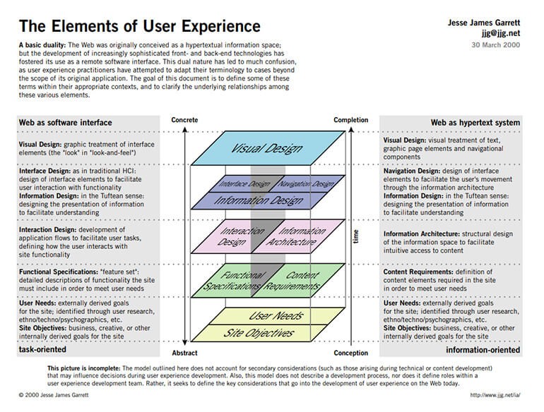
I always found this diagram helpful when teaching about UX and how UI relates to it within the UX Stack.

https://medium.com/omarelgabrys-blog/ux-a-quick-glance-about-the-5-elements-of-user-experience-part-2-a0da8798cd52 [medium.com]

Edited by PHENOMDESIGN - 2024年8月29日 12:30:24
Brave, Big-hearted Rebel
------
Design the Future, Now.
PHENOM DESIGN
------
Processing smarter, not harder on a M3 MAX 36GB
User Avatar
Member
34 posts
Joined: 8月 2024
Offline
PHENOMDESIGN
No. Here is what I mean:


The data comes from "Generative Sessions" or actual creative workshops that are created specially for Design data. I have hosted them on Miro mostly to date.

I do not think they are separate but the UI should be a consequence of the UX as UI is a subset of UX. Also, Design is different from marketing. Marketing is about sales. I am talking about individuals expressing themselves through tools. To do that you need to understand the Qualitative and Quantitive aspects of the experience. The data is so that you don't just say "I think", "I like", instead you can say " we have found"... Not less meaningful or creative, just honors the people you make things for more. You can find how things help others by studying different types of data.

I study what people make and how to improve the expressiveness of the media/medium. I approach this being neurodivergent and that the "data" I deal with is largely qualitative. Though I include both Quantitative and Qualitative measures of values such as usefulness, utility, desirability, performance, feasibility, etc. with an emphasis on accomplishing meaningful tasks.

I always found this diagram helpful when teaching about UX and how UI relates to it within the UX Stack.

https://medium.com/omarelgabrys-blog/ux-a-quick-glance-about-the-5-elements-of-user-experience-part-2-a0da8798cd52 [medium.com]

I get that your approach is probably valid, but honestly, it sounds like a nightmare to me. In my experience, the best way to get great results is to form a small, opinionated team, 1) start working their magic, 2) gather user feedback, 3) debate it among the team, 4) make changes, and repeat. Don’t take feedback too literally, since people often struggle to express their thoughts clearly, do not mean what they say or can be simply wrong.

If I found myself in that kind of environment you're suggesting, I’d probably leave in 5 minutes — it feels like torture to me, but that’s just my opinion.

I’m not saying your approach is wrong; it’s just not my method. There's more than one way to skin a cat. Maybe it does produce great results, I don't know — I haven’t seen the results it can yield, so I can’t judge.
Edited by ruffemotion - 2024年8月29日 14:02:09
User Avatar
Member
159 posts
Joined: 5月 2021
Offline
ruffemotion
the best way to get great results is to form a small, opinionated team, 1) start working their magic, 2) gather user feedback, 3) debate it among the team, 4) make changes, and repeat. Don’t take feedback too literally, since people often struggle to express their thoughts clearly, do not mean what they say or can be simply wrong.

If I found myself in that kind of environment you're suggesting, I’d probably leave in 5 minutes — it feels like torture to me, but that’s just my opinion.

I think especially today, we ask for more humane values. Other people will raise to the occasion. Just sharing knowledge from practice built over many years.
Brave, Big-hearted Rebel
------
Design the Future, Now.
PHENOM DESIGN
------
Processing smarter, not harder on a M3 MAX 36GB
User Avatar
Member
25 posts
Joined: 7月 2019
Offline
A viewport toolbar that I recently liked a lot is the mockup scheduled for the next version of UE
User Avatar
Member
103 posts
Joined: 1月 2018
Offline
I agree with the topic that Houdini's UI needs to change!

Great mockup. I love the animation toolbar; it feels more standard now. The current one in Houdini feels like a Frankenstein of a Winamp .mp3 player combined with Amiga OS xD

I also love the idea of workspaces.

Since Matt's icon design is more of an illustration than an icon (which sometimes is good, e.g., for a help file with large icons where you can see all those detailed shapes, various color gradients, shadows, highlights, and whatnot), yours, however, went a bit into another extreme. It's a bit oversimplified. All the icons look the same.

My favorite example is MAYA's icon ideology, which uses quite simple shapes while still describing what's important. Color coding, for example, grouping icons with the same color for particle operations, another color for geometry, another for animation bones and constraints, etc.

I'll make my own mockup when I have time. It looks like fun!

By the way, maybe the next generation of Houdini UI should be as open as possible, so artists could make their own placements of icons, choose their sizes, and even design the icons themselves (in vector format!).
And then, perhaps, create shareable skins?


.
Edited by oldteapot7 - 2024年8月31日 14:38:32
User Avatar
Member
34 posts
Joined: 8月 2024
Offline
oldteapot7
I'll make my own mockup when I have time. It looks like fun!

That's fantastic, I'd love to see it & talk about it! I'm working on a V2 version of my mockup right now, taking into consideration all the feedback I got so far. I'll share it when I feel that it's ready.

oldteapot7
By the way, maybe the next generation of Houdini UI should be as open as possible, so artists could make their own placements of icons, choose their sizes, and even design the icons themselves (in vector format!).
And then, perhaps, create shareable skins?

Yep, absolutely!
Edited by ruffemotion - 2024年8月31日 17:05:00
User Avatar
Member
112 posts
Joined: 10月 2018
Offline
The mockup is nice, having said that the menubar, layout of the buttons and the nodes are all wrong. It seems you've drawn too much inspiration from Blender, which has led to a loss of crucial functionality. Instead of improving upon Houdini's existing, albeit outdated UI, your design ends up feeling like just a superficial makeover.If you're looking for a UI that aligns more closely with Houdini then it's Cinema 4D's interface which might serve you better as a reference point. Your approach suggests a lack of understanding of Houdini’s "unique" requirements/workflows, and it appears you were more focused on achieving a Blender-like aesthetic rather than addressing the core issues of Houdini UX/UI, but I'll say again the mock is good and obviously considerable time's been taken into crafting it. Also worth mentioning is that they'll never achieve that level of alignment of ui elements in houdini due to qt
  • Quick Links