I wanted to customize Houdini's theme, because I find the default one overloaded with all sorts of visual clutter (gradients, bevels, etc…) making it a lot harder to learn the software, as complicated theme makes many UI elements look a lot more complex than they really are.
I decided to modify it to create that modern, flat and clean look, however I've stumbled on quite a few roadblocks. I started off by duplicating the default UIDark.hcs and going forward from there. This is what I have so far:

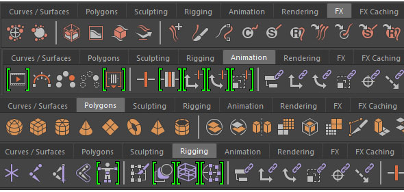
The first problem I have is that I haven't been able to find an entry that edits top bevel highlight on the shelf, leaving me with that ugly Windows 95 bevel at the top of the shelf:

Second issue was that I wasn't able to find entry that controls the color of those minimize arrows on the bar. They should have color matching to the background so they don't stick out so much. They are pretty irrelevant part of the UI, so there's no reason for them to be obvious.

As for the third issue, could we please get rid of this? The hardcoded auto-bevel done by inverting the base background color? Presence of this makes it impossible to create custom, modern looking themes.

Any help is appreciated, thanks in advance.


