An original look and feel to animation can be a tricky thing to pull off, but that’s exactly what the makers of the music video for Mitski’s ‘A Pearl’, accomplished by combining both 3D and cel animation techniques.
SideFX caught up with director Saad Moosajee and technical director James Bartolozzi to discuss how ‘A Pearl’ was made, and how Houdini formed part of the process.
Watch ‘A Pearl’
The Brief
‘A Pearl’ is a Spotify project - the audio streaming platform approached Brooklyn-based music video production and direction studio Art Camp with a brief to create a vertically oriented (1080x1920) music video for Mitski that would play on Spotify. “A stipulation of the project was that because Mitski was on tour we wouldn’t be able to film her,” says Moosajee, “so the video would need to be fully animated. Art Camp then approached myself and (co-director) Danae Gosset to work on the video.”
Moosajee and Gosset were given a wide gamut in which to make the video, and looked to various references for inspiration. One recent music video, ‘Fruitflies’ for Gabriel Garzón-Montano, on which Moosajee had collaborated with Art Camp had introduced 3D animation, while a title sequence for FITC Toronto 2018 - which Moosajee and Bartolozzi both created - had made use of one continuous shot with a variety of twisting and dynamic motions. Art Camp wanted to incorporate those kind of movements with 3D, while also retaining a hand-drawn feel. That drove the style for ‘A Pearl’.
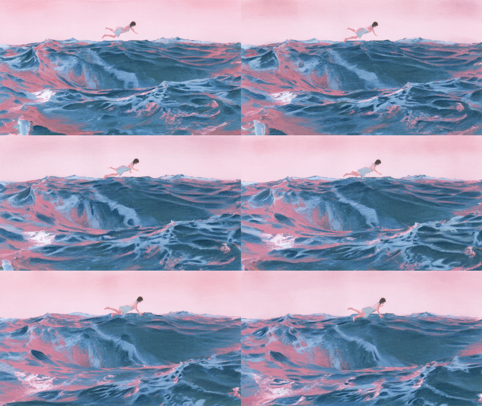
A test shot for the ocean section.
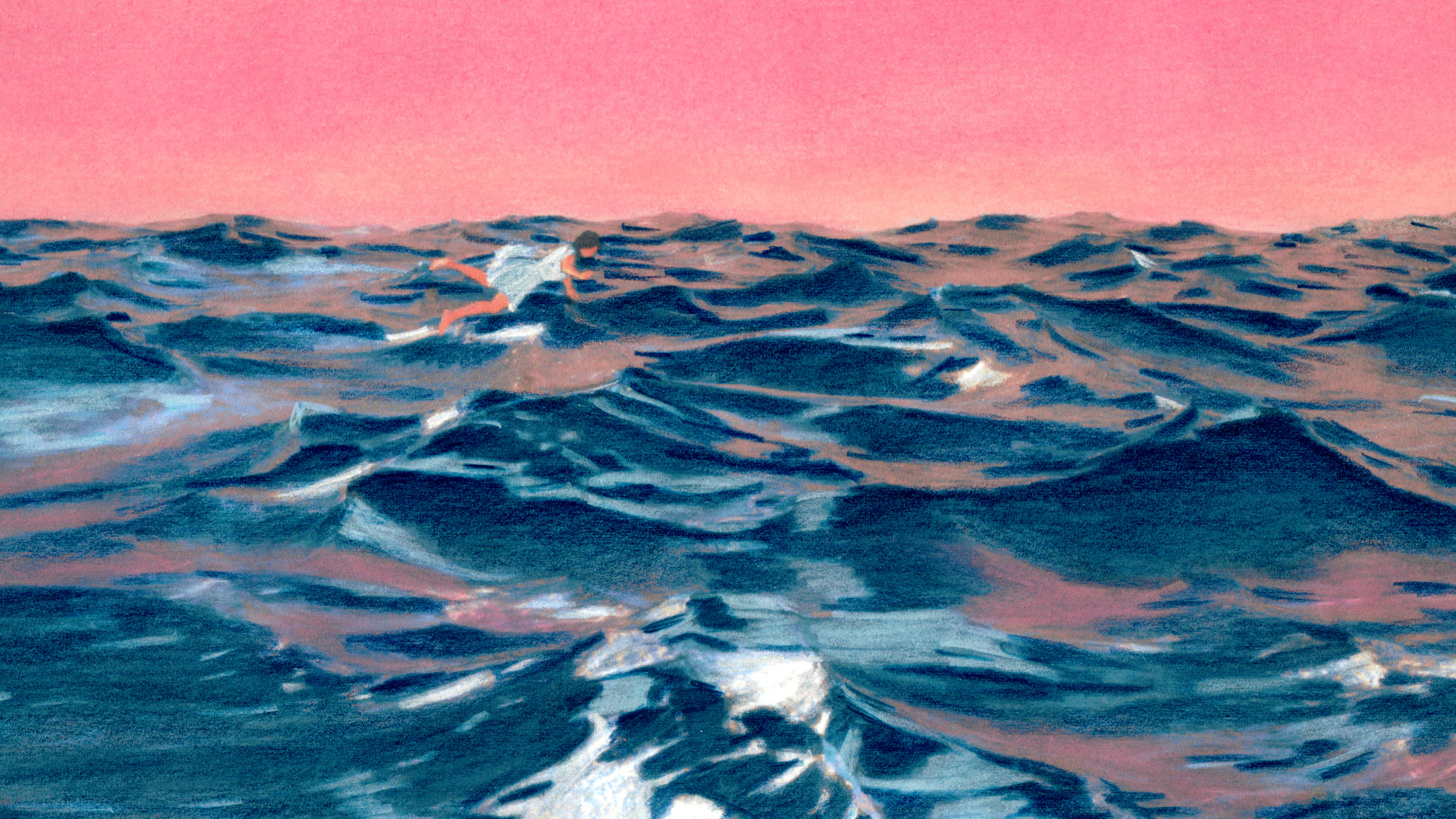
A frame from the final ocean section.
Finding the Look
Balancing the desire to feature both the qualities of 2D and 3D, Moosajee says the hardest aspect was figuring out which medium to favor. “When you look at the first tests we made, you can see the two mediums are present in the animations, but sort of side by side, rather than in harmony. You’ll also notice there’s much less detail in the 3D component of the sketches, most of the renders are grey. This was mainly because the piece was supposed to be turned around fairly fast, and was supposed to be at a 1920x1080 format, so there didn’t feel like a huge need for a lot of detail in the 3D renders. There was also concern voiced that by adding too much detail into the 3D, it would detract from the human quality added by the 2D.”
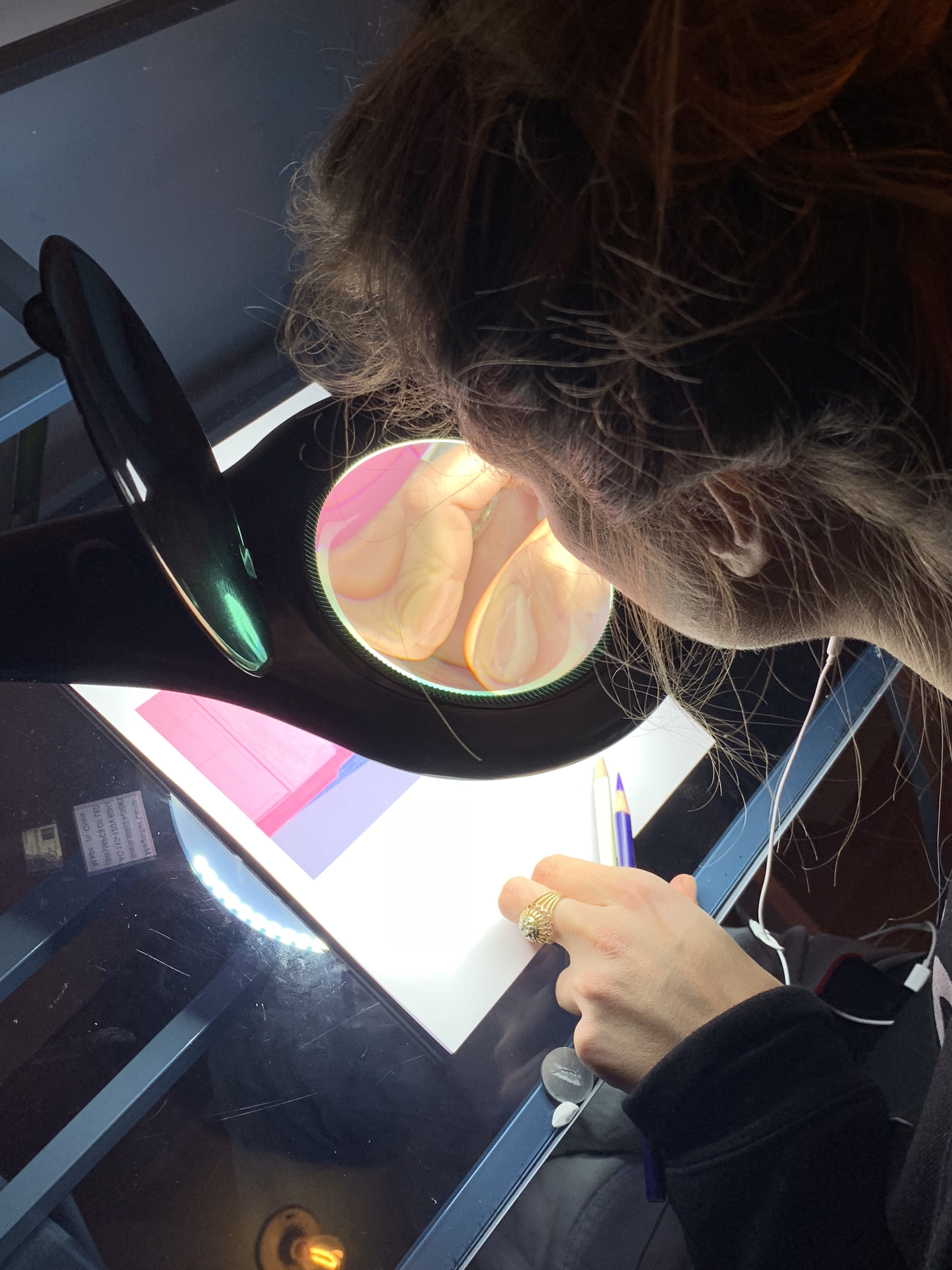
Each frame of the animation was printed out and then augmented by painting, drawing and further illustration.
However, as Moosajee and Gosset continued to produce tests, they began to see more and more promising results. Says Moosajee: “After we made the first test of her passing through the white paint house, I noticed that the 3D lighting and color palette actually had a pretty big influence on the final visual quality of the piece. Up until that point we’d been using a grey character; the plan had always been to make the character resemble Mitski but we weren’t sure at what capacity and detail. Based on that test, I created a fully colored Mitski character with skin tones, and explored different ways to light the skin in 3D that I felt would translate well into the physical process.”
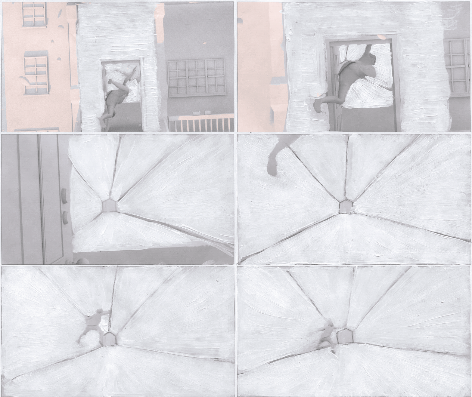
A test of the character passing through the white paint house.
The first real test of this technique saw the character falling into the flowers as a closeup. For this test, Gosset changed the process slightly. In the earlier tests, she had been drawing and painting on top of or around the character or scene, whereas in this test she drew into the tones of the character’s skin and dress, matching and enhancing the pre-existing colors. “This test,” notes Moosajee, “was the first time we achieved a more ‘painted’ effect in the animation, where both 3D and 2D lived in harmony rather than opposition.”
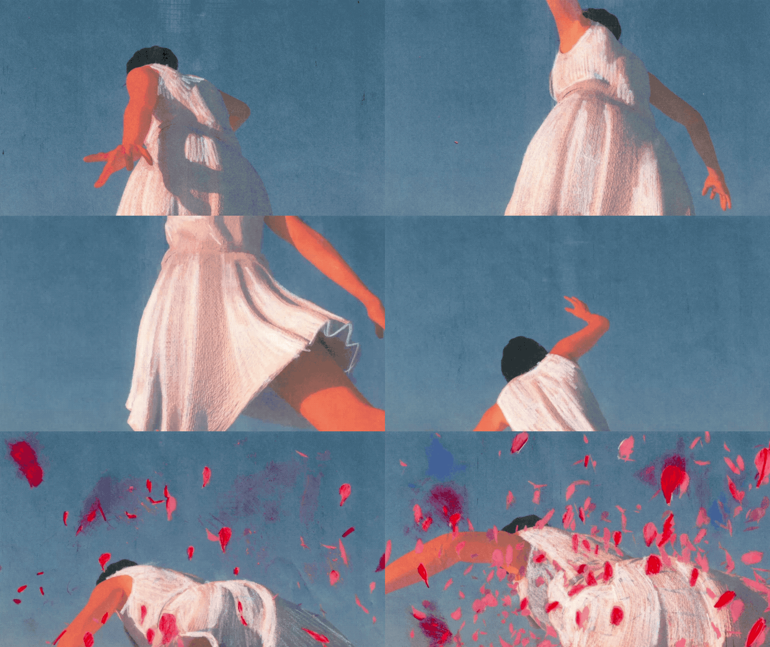
A test sequence showing the character falling into flowers.
On a conceptual level we saw Houdini and the idea of simulated animation as an opportunity to add an additional element of surrealism and surprise to the behavior of the world we were creating.
Saad Moosajee | DirectorEmploying Houdini
Houdini came into ‘A Pearl’ as a way of creating procedural geometry and handling simulated animation. In particular, Houdini’s Vellum, Ocean Toolkit and Bullet RBD were relied upon to help make the music video. “On a conceptual level,” explains Moosajee, “we saw Houdini and the idea of simulated animation as an opportunity to add an additional element of surrealism and surprise to the behavior of the world we were creating.”
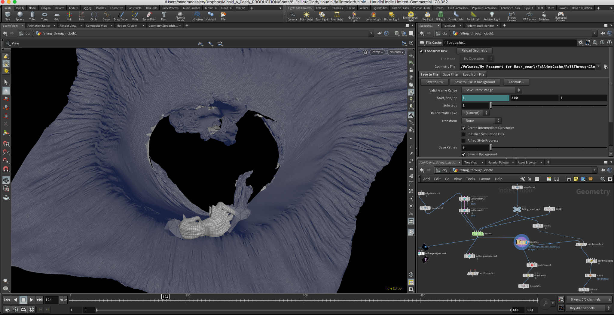
Houdini screenshot showing how Vellum was used for the cloth sim.
“It was also interesting from a technology point of view to try and fuse some of the old school drawing and painting techniques we were using with the advanced 3D capabilities offered by Houdini. What would it feel like to paint into a cloth simulation? To crosshatch over fluidly moving water? These were some of the ideas I had early on that made me excited about how we could use Houdini. For me it represented the idea that you could create something that seemed familiar to a viewer’s expectations through frame by frame painting and drawing, but then add this element of unexpected magic through Houdini.”
Houdini’s new Vellum dynamics system came in handy for a particular shot in the music video where the character exits the house and falls and rips through a strange cloth-like fabric back into the sky. Moosajee says Vellum was chosen for its ability to control the process.
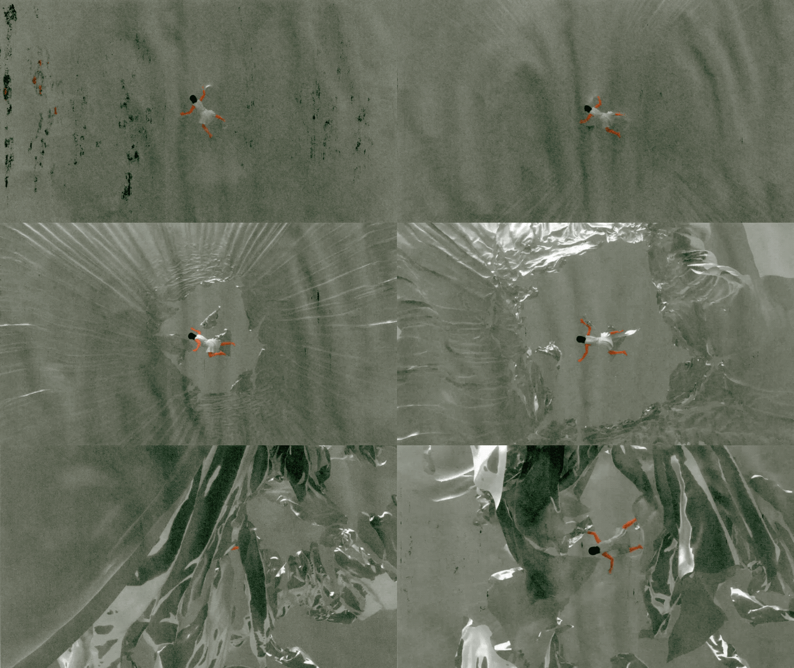
Cloth simulation test shot.
“I’ve always found simulation really interesting, but also a little cumbersome to art direct and design around because of cook/cache times, stability, etc. After I checked out what was new in Houdini 17, I was really excited about the development of Vellum because of the improvements in stability and speed, but also because of the logical and streamlined approach towards cloth simulation, softbody simulation, etc. It was a great feeling to open up Vellum and look at a tool that was intuitive to use and was reliable in its scalability and stability, especially for someone like myself who wants to get into the artistic side side as quickly as possible.”
I’ve always found simulation really interesting, but also a little cumbersome to art direct and design around because of cook/cache times, stability, etc. After I checked out what was new in Houdini 17, I was really excited about the development of Vellum because of the improvements in stability and speed, but also because of the logical and streamlined approach towards cloth simulation, softbody simulation, etc.
Saad Moosajee | DirectorMoosajee began sketching in Vellum with the idea that the character would at some point in the story quickly fall through a series of bedsheets or curtains - the idea being that these would have flown out of the house and cabinets in the first half of the video. “Because of the speed and flexibility of Vellum,” he says, “I was able to simulate far more iterations and sketches than originally anticipated, and quickly realized the shot had the potential to be a key moment in the video rather than just a quick moment.”
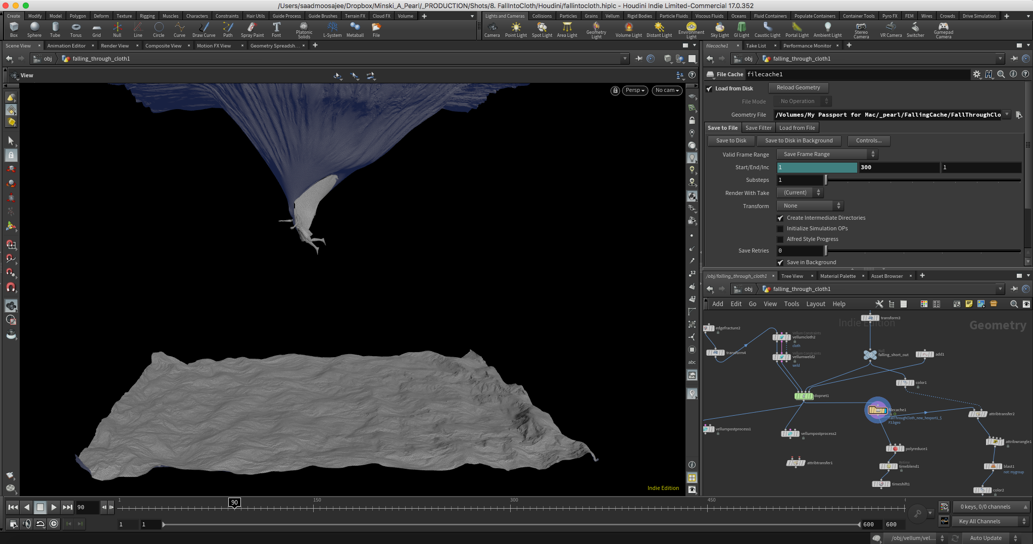
Vellum enabled the artists to create effect soft-body simulations.
“Another turning point,” adds Moosajee, “was when I incorporated the Weld Points feature of the Vellum Constraints node, which I used with some basic VEX to control when the character would rip through the cloth. That level of control allowed me to art direct the emotion and energy of the fall exactly the way I wanted, which is something I’ve always had a hard time doing with simulation. I’ve been told by most viewers of the video that the sequence is one of, if not their favorite part of the film.”
Keeping the Hand-Crafted Feel
Although Houdini allowed for very particular imagery to be created, an important aspect of the production, of course, was to retain that 2D feel. Bartolozzi - who has worked at Pixar and SideFX - was able to bring some unique simulations and tools to the project that he then says Moosajee could “dial back 80% to a place where they are tasteful and cohesively fit into the production.”
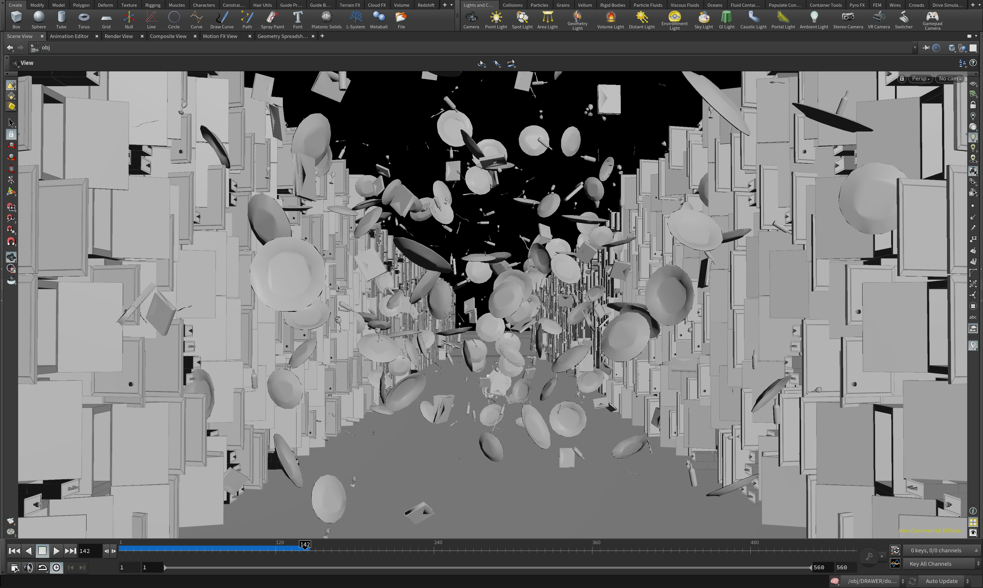
The cabinet simulations for the music video.
For example, notes Bartolozzi, the cabinet simulation in ‘A Pearl’ involved a pre-simulation to tightly stack randomized cabinets using an RBD sim. The door openings and projectiles were triggered by the moving character. “We used a multisolver to handle the projectiles and RBD objects,” notes Bartolozzi. “When I handed off the simulation, I think there were probably 2000 cabinets and a whole lot more projectiles. I knew that this was over the top, but I love to push Houdini - and my computer - to the limits to see what’s possible. To fit with the aesthetic, as well as to relieve Danae of painting over so much detail, the complexity was reduced considerably.”
The buildings were procedurally generated, attached to the grid, and then fed through multiple bend SOPs to create the motion. This is not a simple task in basically any other 3D software package, but most Houdini users will recognize that this is pretty basic Houdini functionality.
James Bartolozzi | Technical DirectorMeanwhile, the city in the music video was generated using a quad tree subdivision on a grid to create the spacing of the buildings (modules and assets from Houdini generalist David Fuhrer were relied upon for this). “The buildings were procedurally generated, attached to the grid, and then fed through multiple bend SOPs to create the motion,” describes Bartolozzi. “This is not a simple task in basically any other 3D software package, but most Houdini users will recognize that this is pretty basic Houdini functionality. The procedural nature of the system helped us try out a lot of different scales and shapes for the city, until the project’s time constraints lead us to what was featured in the video. My one regret is that we didn’t have enough time to dial in the complexity of the city to the same degree as the cabinets.”
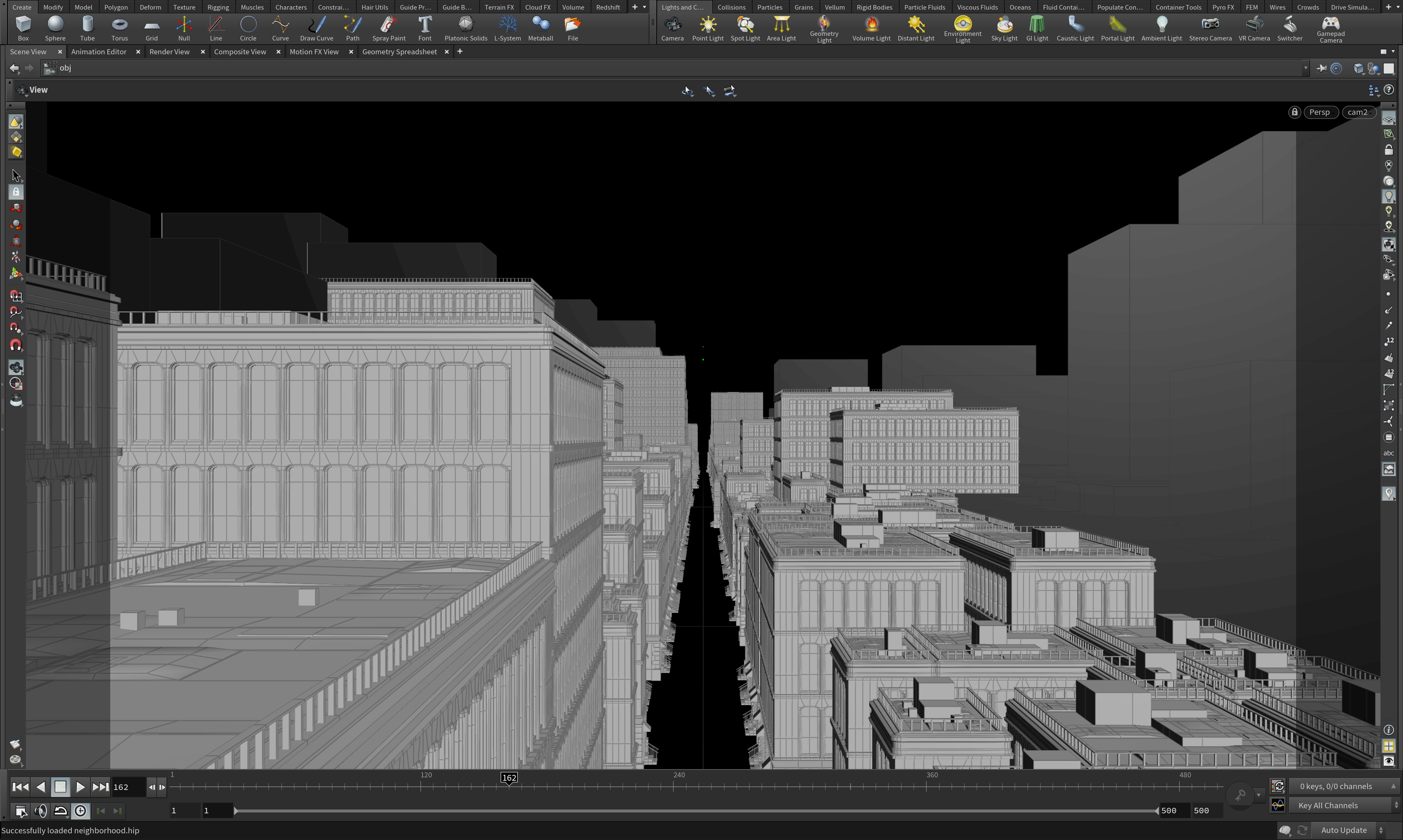
City generation.
Getting the detail in there had to be balanced with the push for maintaining a 2D aesthetic. As Moosajee discusses, “the animation is interesting stylistically because it presents moments where the 3D is entirely covered and transformed by the painting and drawing, but also moments where the scene is entirely 3D and is only accented by painted and drawing.”
“In these sorts of moments,” says Moosajee, “it became important to selectively accent and improve the 3D with the painting and drawing to maintain the feeling of hand craft, without losing the qualities that it already had going for it. This was easier said than done though because of the sheer amount of time the painting and drawing would take, and by the fact that it was only being done by one person.”
COMMENTS
Please log in to leave a comment.