CRAFTSMAN: SCENE ASSEMBLY, COPS, LIGHTING & LOOKDEV
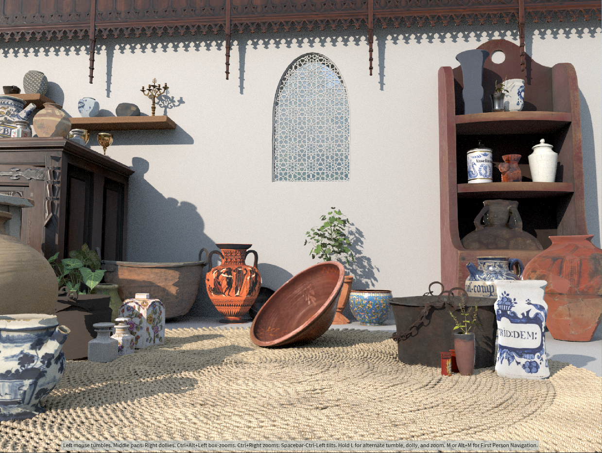
To demonstrate the power of the new COP tools, we decided to create a still life of a craftsman, creating wonderful vases. It’s directly resembling the actual creation process of the textures.
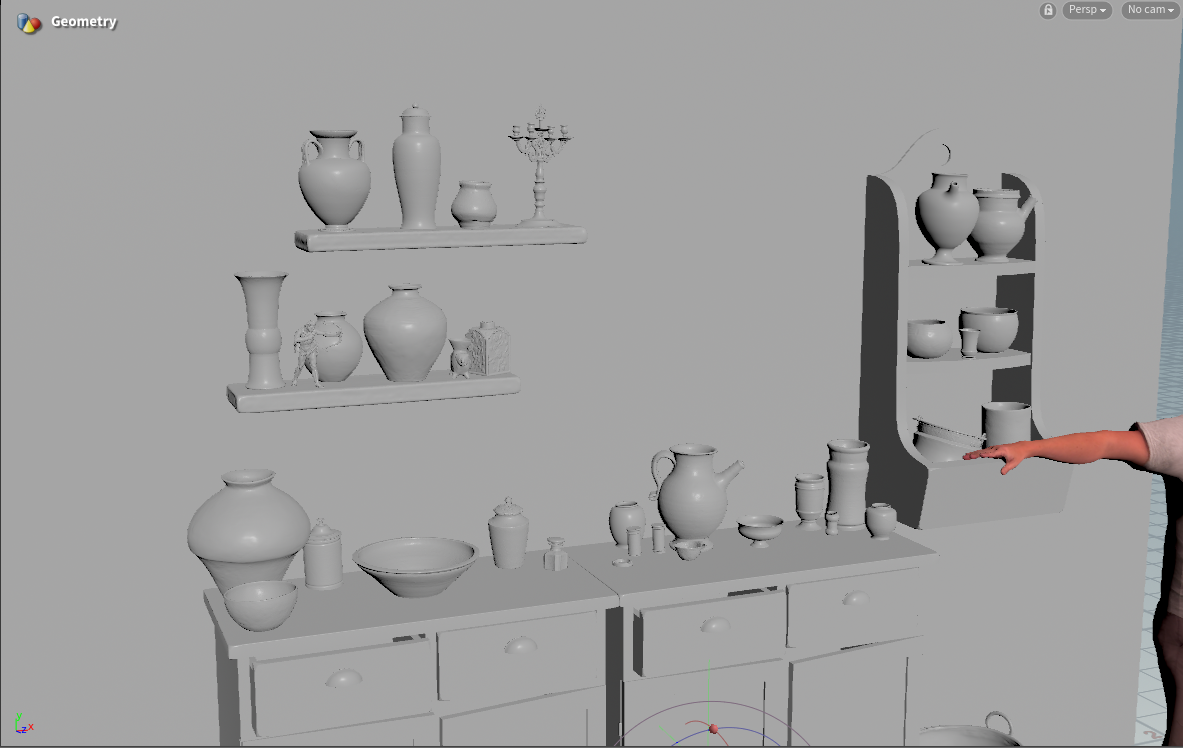
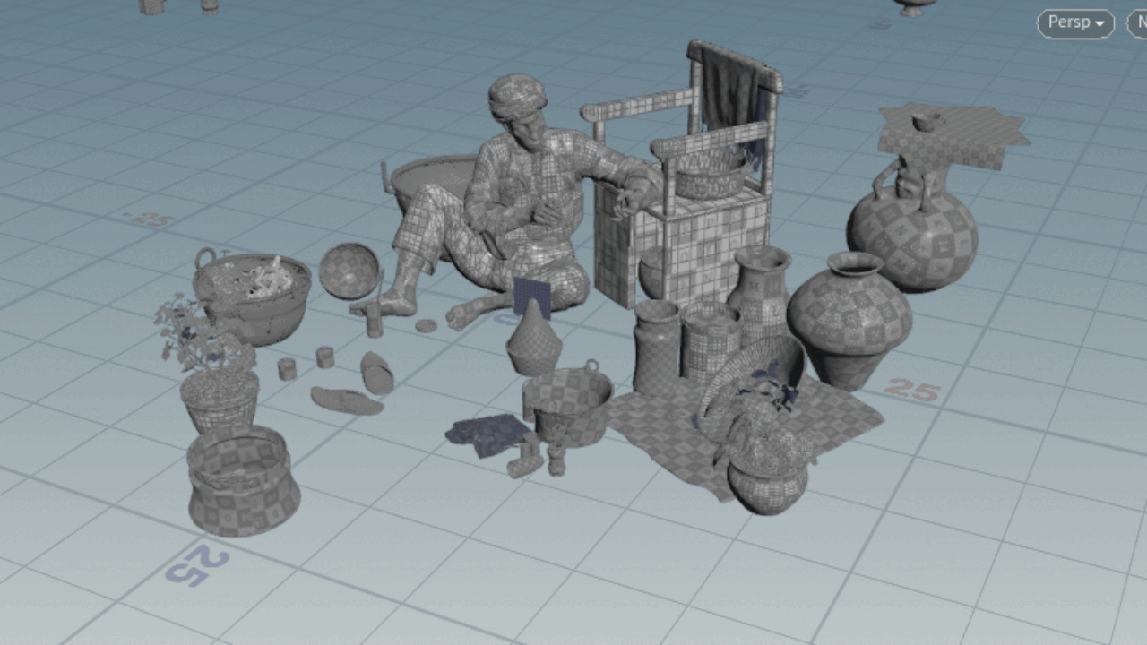
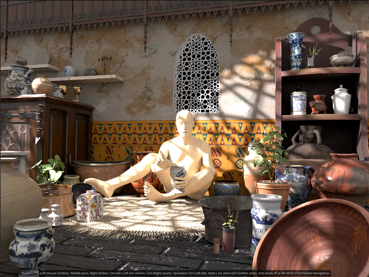
Initial Layout
TIP
It's much easier to figure out the scaling of online assets when you have a reference point for it. I used the temple body as a reference, it helped me to scale my things properly.Carpet Creation
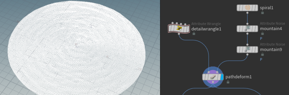
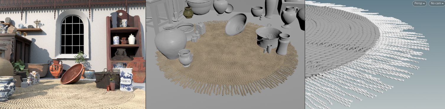
For the carpet, I started by gathering some references. The plan was to create a composition in Arabic/Persian style, so I researched what kind of carpet would suit the setting. I end up with a braided jute rug. It was something that would work and that was relatively easy to do.
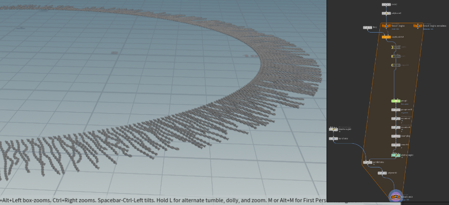
I decided to go with a round carpet. For the braids, I used the code from everythingcg. I created a braid and adjusted the settings for my needs. After I got myself a nice spiral with some randomization on the P value. I used path deform to swirl my braid into a rug-looking shape:
It’s a very minor detail, but it makes a visible difference:
After that, all that was left was to combine the base of the rug with braid strands and a very simple jute braided rug was ready!
After some more adjustments to the render, this is what I ended up with:
Window Creation
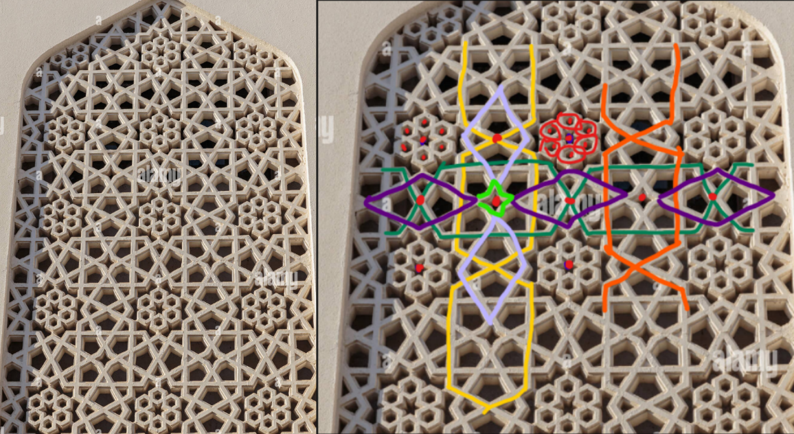
It was time to create a better window. I found a nice pattern on the internet and decided to replicate it. I broke down the pattern to better understand it. It was made out of simple shapes, which were very easy to replicate.
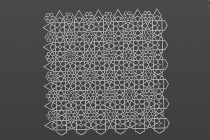
It slowly started coming together:
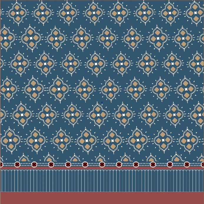
COP Texture Creation
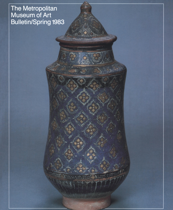
Reference
Main pattern

Bottom pattern
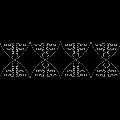
I decided to improvise this part. I started with a bunch of points that I created by importing lines from SOPs with a bunch of points to them and using a stamppoint again. After that, I repeated the same line importing/stamp point slapping process a couple of times to have bigger circles with a cross-like shape inside them:
The next part was to create a background for it. I decided to replicate the same collection of parallel thin lines. I made an SDF shape of the line and converted it to mono leaving only the outline. The result was a nice thin U-shaped form that I was able to easily repeat with the same SOPs lines importing trick. After some coloring, position adjustments, and blending, I had this result:
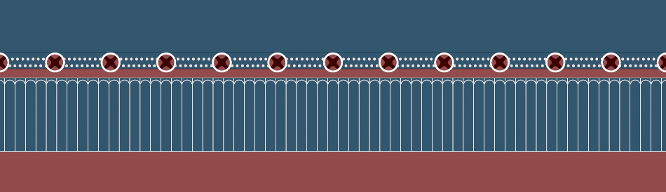
And just like that, the base of the pattern was ready:
Bottom pattern
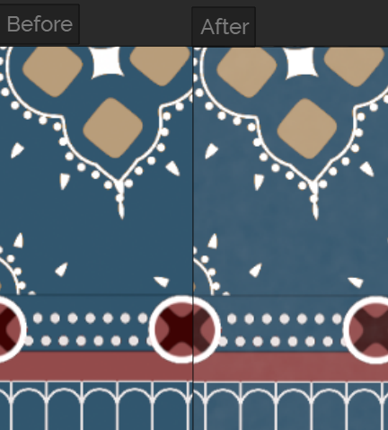
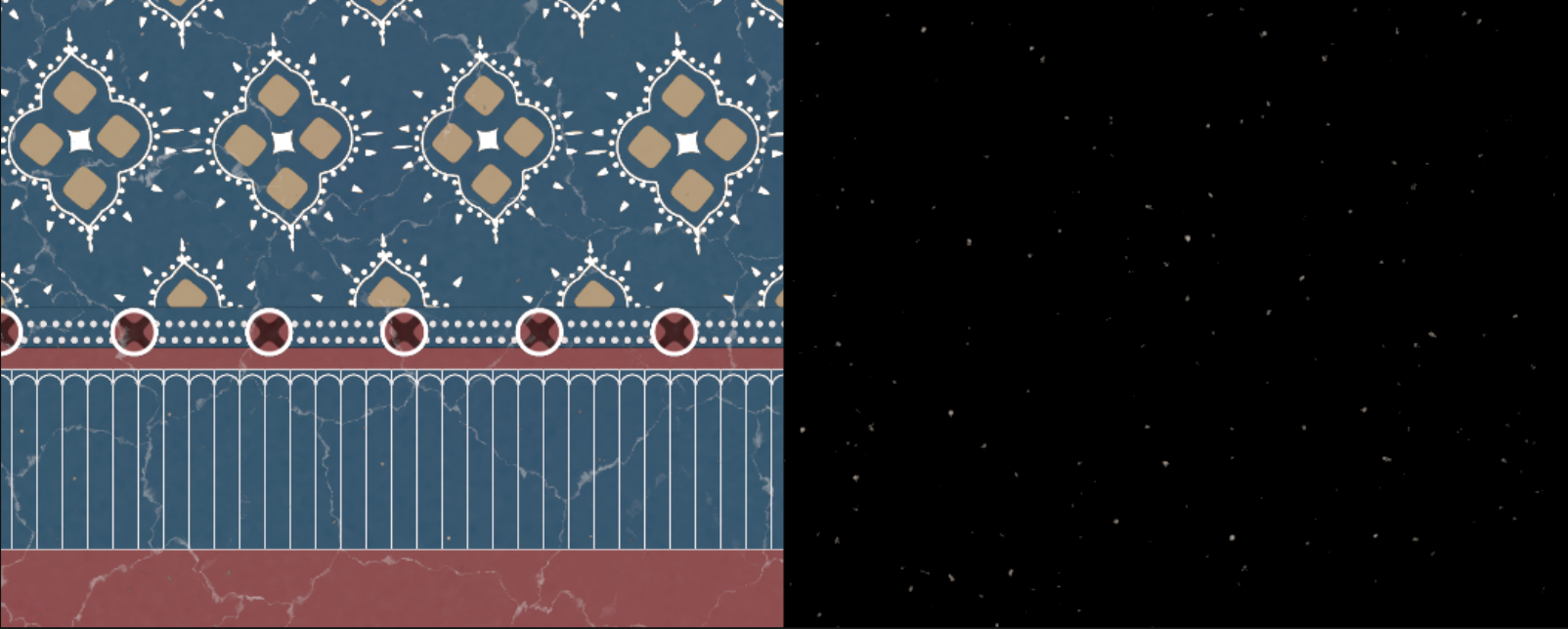
To add some realism, I added a few dirt chunks using simple fractal noise and mono to rgb node.
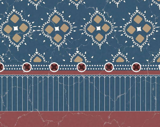
To finish up the noise creation step, I added some touches with very X-axis distorted fractal noises to imitate accumulated roughness on the ceramic surfaces.
And now the final look was ready!
Export
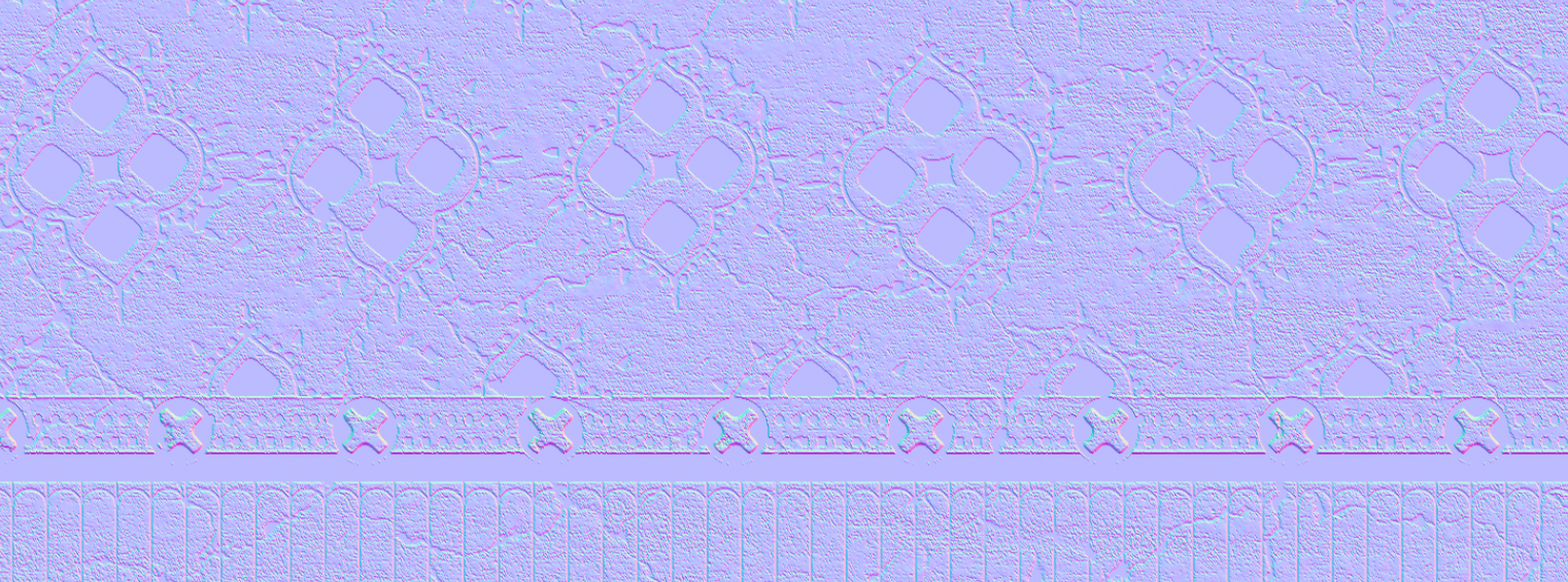
I needed to export three maps: diffuse, normal, and mask for some shader adjustments. Exporting diffuse was a straightforward process. For the normal, I converted the rgb texture into mono, then remap node it and used height to normal node to generate a normal map from the height map:
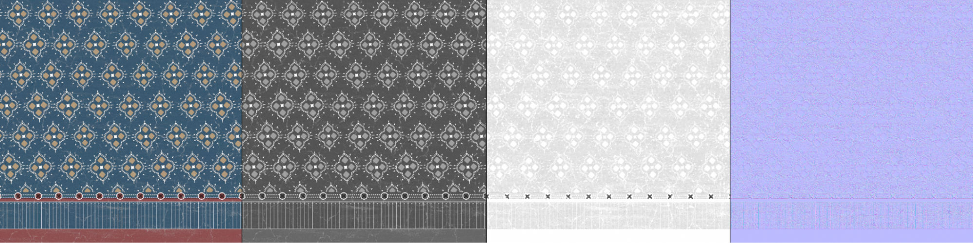
The result was a nicely looking render-ready normal map:
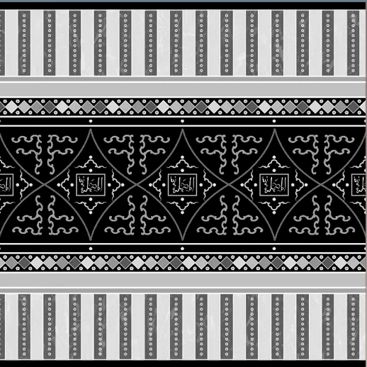
Main pattern
For this one, I went with this reference: (means "the moment")
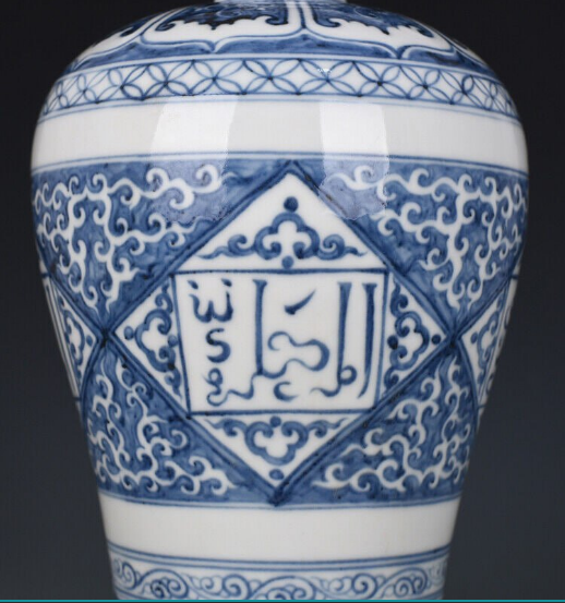
The first thing was to create a mustache-like pattern. For the middle part, I just used some spiral SDF shapes and for the end, I used some curves created in SOPs with varied pscale attributes. By doing that I was able to control the thickness of the line and make it gradually thinner when using stamp.
Shortly after, I drew an Arabic calligraphy sign and imported it back to COPs. I made it with different curves to imitate the way you would write it. I added a gradually increasing pscale attribute and stamped a slightly rotated rectangle to mimic an ink stroke. After that, I pasted the mustache pattern around it:
For the next part, I imported some points in F shape from SOP and stamped a curve of a spiral to them. After, I added some nice curves to follow along, which were also created by importing stuff from the SOP level. At this stage, I was ready to add more horizontal details.
Horizontal details
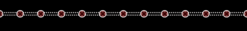
I started with masking. I needed to mask some elements of a previously slapped pattern. So I created two thick black lines and added them on top to cover unwanted stuff. After that, I added additional horizontal lines to both sides of the pattern:
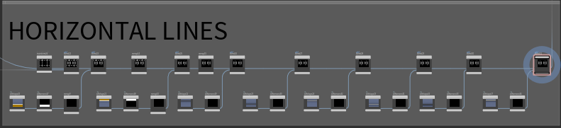
Then, I added some diamond shapes between those lines:
TIP
Currently I’m in mono mode, but I'm about to change it and create a color for it. Because of that, each element has a different value. For example, as you can see, every 4th diamond is a bit different shade of gray. It is because it would be easier to manage color assignments down the road.
Additional elements and vertical lines
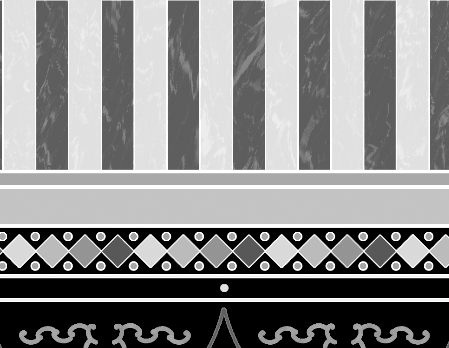
After adding even more horizontal lines, I proceeded to add more vertical ones to both sides of the main pattern. I decided to go with something that resembles a marble texture. For that, I used some fractal noises set to UV signature. It was handy to plug those into UVdistort node and alter some simple fractal noises to my likeness. After creating two rounds of vertical strips and adding them to the previous pattern, I ended up with something that looked like this:
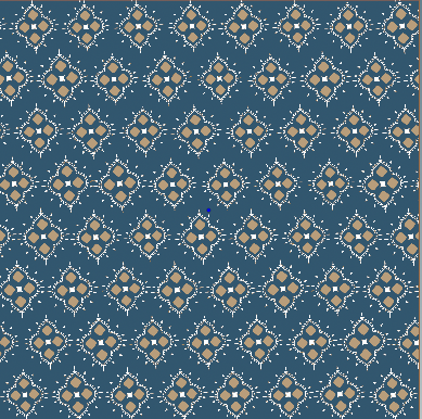
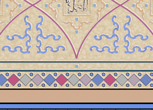
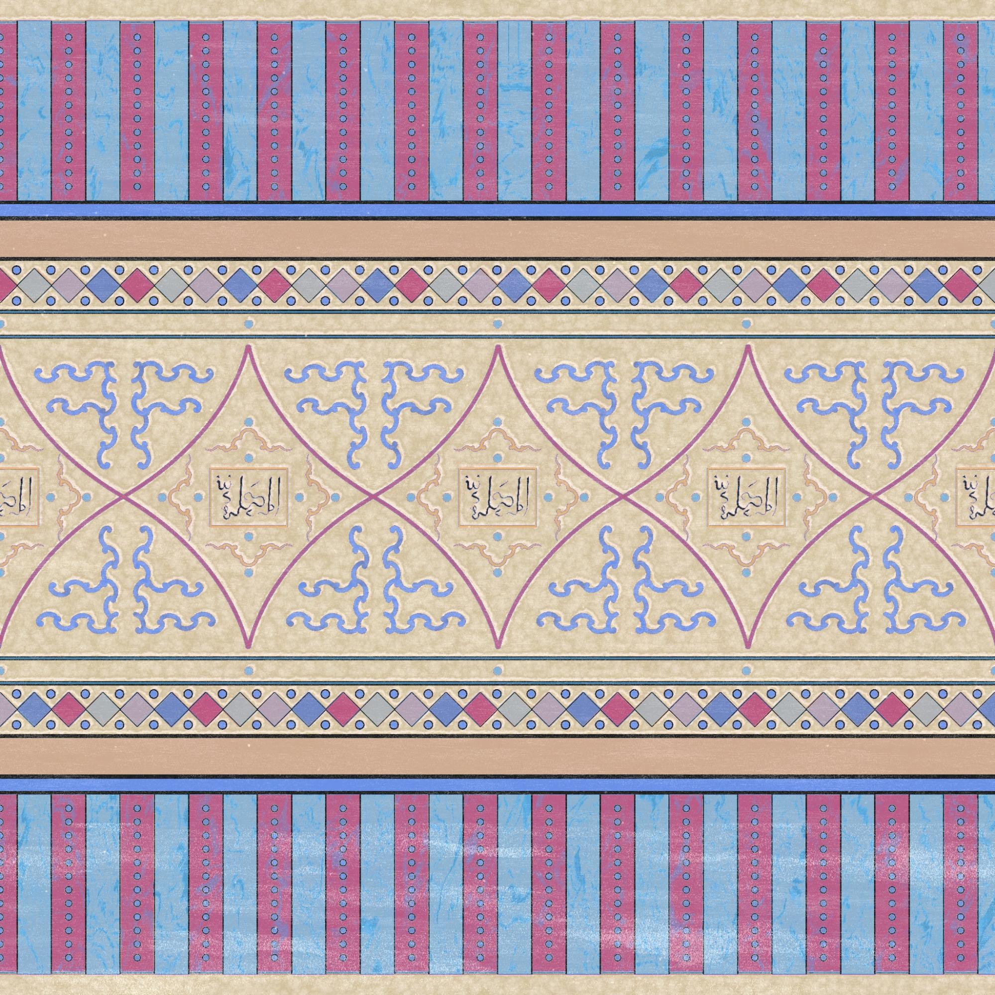
Coloring
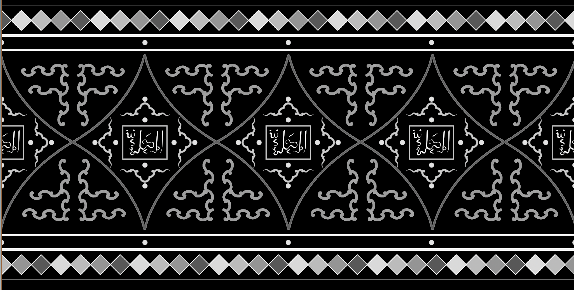
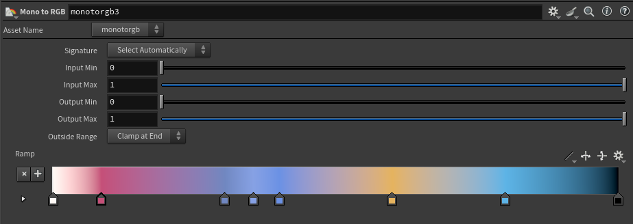
The most exciting step! To apply different coloring, I simply used mono to RGB node. And because I precisely altered each element to be a specific shade of gray, it was really easy to bring some colors to the function! Here is how the node settings looked like and the final colored result:
To add more depth to the white background color I created a paper-like texture combining some fractal noises and playing around with mono to RGB node. Once again it was really easy to achieve the desired result:
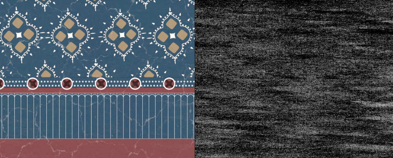
Finishing and Normals
To finish up, I added the same X-axis distorted noise on top. I added more noise to the bottom of the vase to make it more realistic. For the normal map, I decided to make it less harsh with fewer details. It was really easy to do, I just slapped the remap node before converting mono map to a normal map, I was able to control the number of details by a single slider:
And just like that the texture was ready! Very nice!
COP Texture Creation
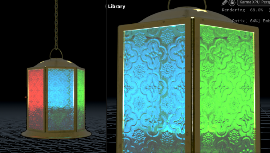
Lantern normal map
Lantern normal map
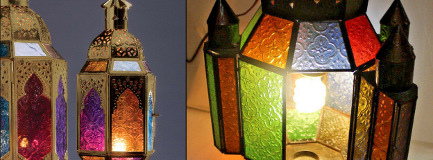
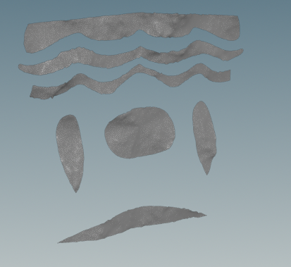
For the lantern, I decided to unleash the full potential of the SOP importing. I started by gathering some references:
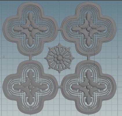
I decided to go with something like what you see on the right. I modeled the shape of the pattern in SOP using simple geo. After that, I converted everything to VDB to smooth it out and create a more uniform shape. After some copy-pasting and final adjustment gestures, the shape was ready:
TIP
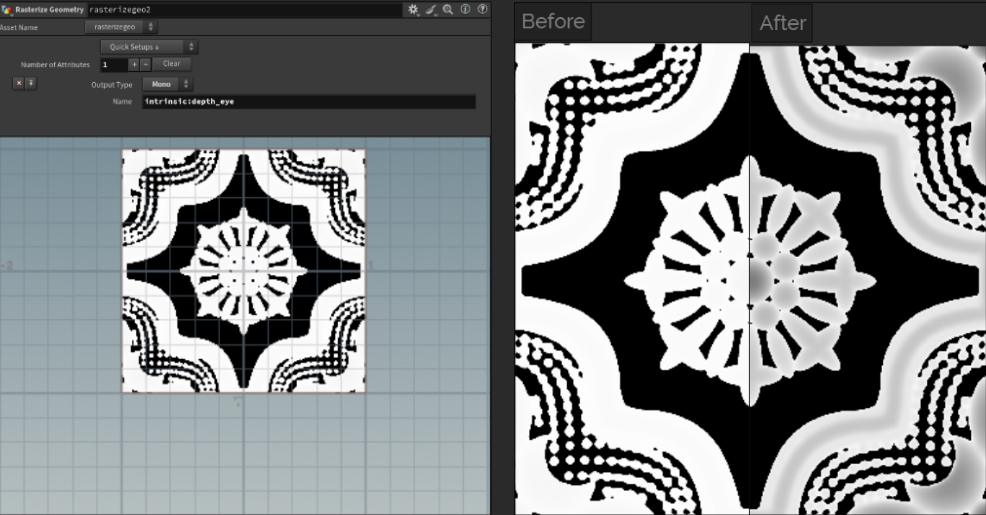
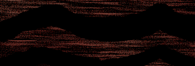
When importing SOPs, COP will only capture the YX square from -1 to 1. As you can see, some parts of my shape are exciting. It’s done intentionally so I can easily seamlessly scale the pattern.
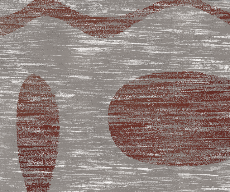
I’m using a rasterized geo node and I'm rasterizing the depth of the imported SOP model. As you can see on the screenshot, the captured area is indeed -1 to 1. The depth appears uniformly white because the value of the pixel is greater than 1, remap node solves this issue:
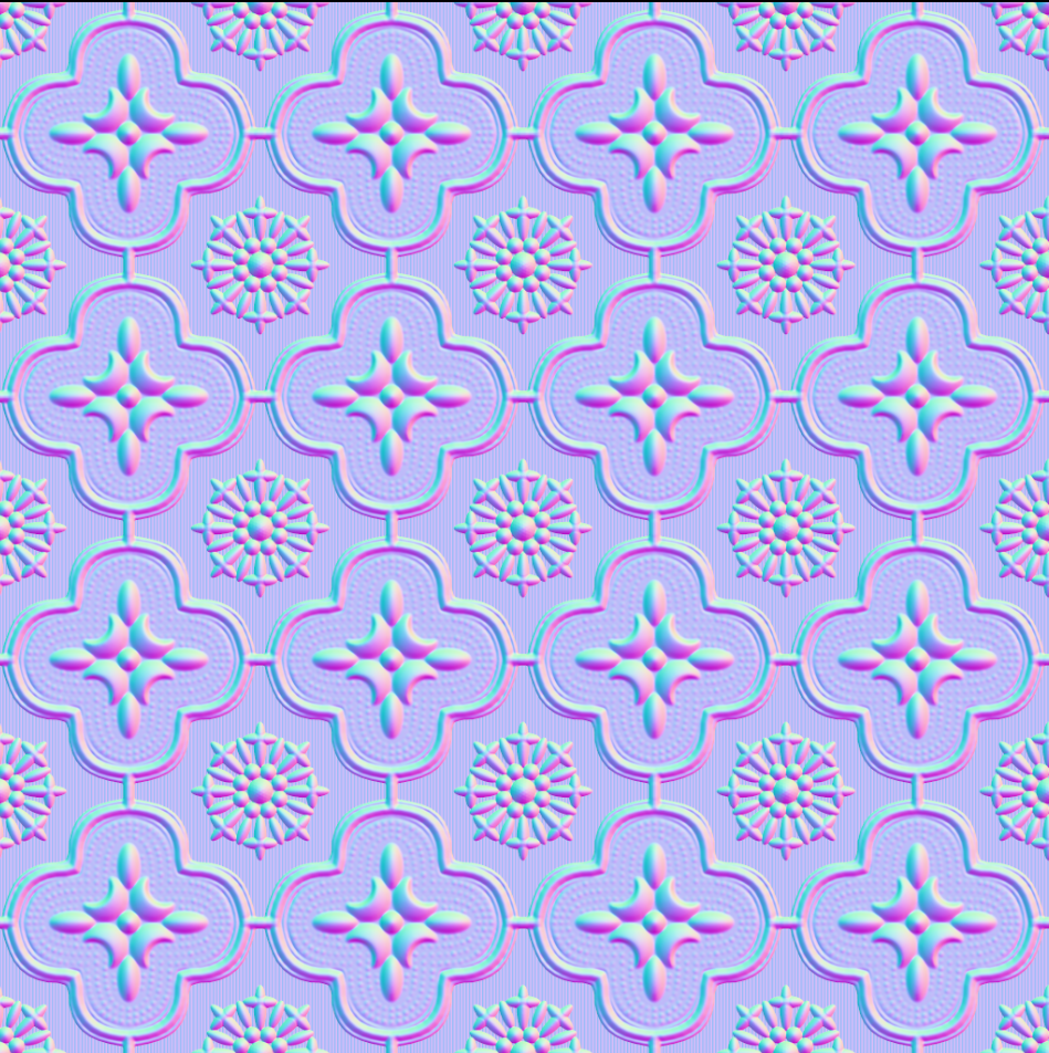
After using height to normal node and some scaling, we end up with this nice-looking pattern:
Main pattern
I started with modeling an interesting shape using the planar patch from curves node and then, I randomized it a lot using simple mountain nodes. I mirrored the shape so the resulting texture would be seamless.
I created some distorted harsh fractal noises to apply to the main pattern. The idea is to make an old-looking vase with multiple rough patches and destroyed layers of paint.
Background
For the background, I went with a similar approach, combining stretched bright fractal noises with some fine darker fractal noises. The result was simple yet effective. After combining it with the pattern, I got this result:
Additional noises
Additional noises
Although the main texture was ready, I decided to sprinkle some randomness on top. I added multiple scale noises to create a difference in the brightness of the texture in different areas. I also added some bits and chunks to simulate cracks in ceramics that will accumulate over time. Here is the animation of the layers involved in creating a final result:
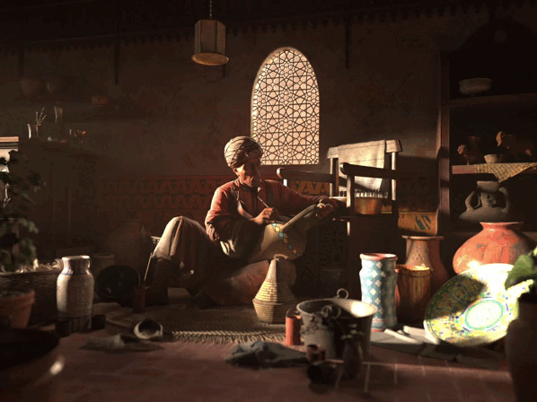
Final Lighting
As we gathered all of our textures and created a layout of the scene, it was time to finish it up with some nice rendering.
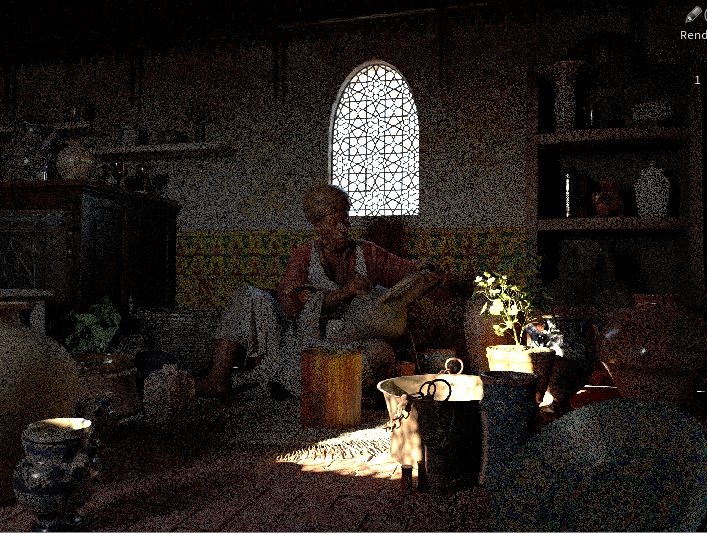
In my very first setup, I decided to go with a gobo light. I created a light filter and assigned it to the distant light. So far as you can see, the scene is not ready for the final render. I was experimenting with lighting techniques. Gobo works pretty well, but I wanted to make the scene more intimate. For that, I decided to use high-contrast warm lighting.
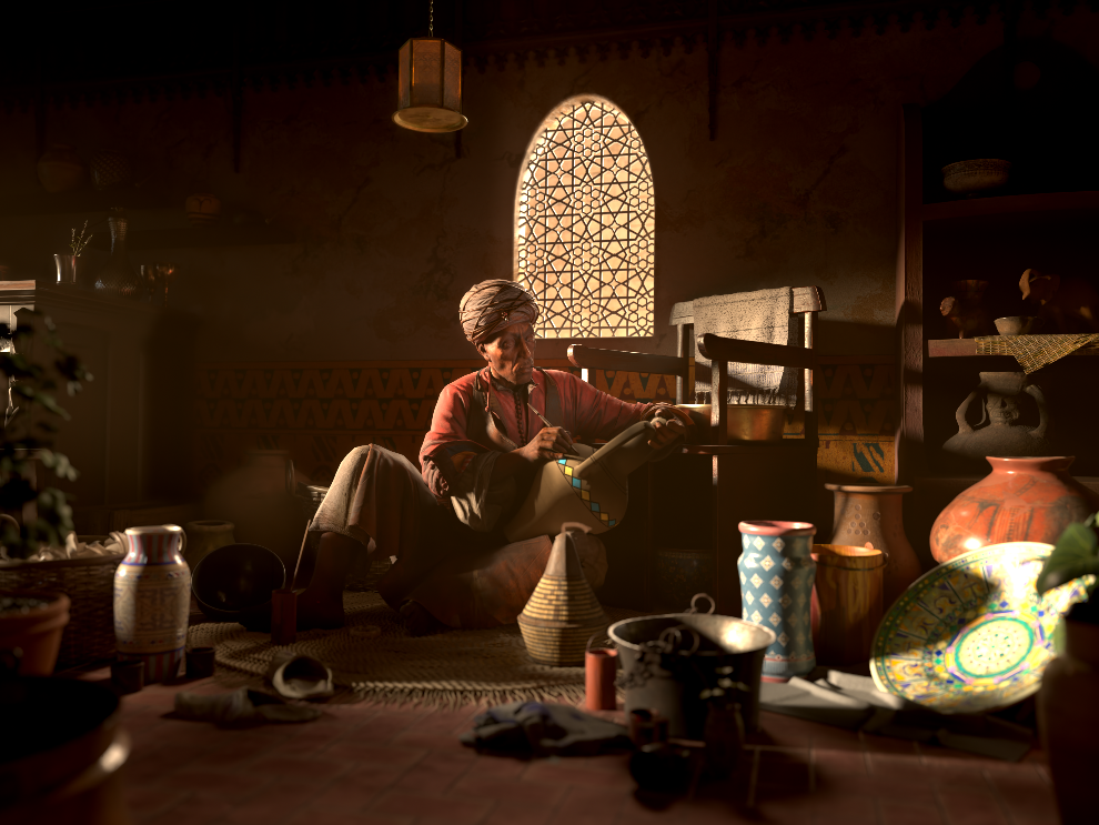
I switched from using gobo lighting to a new and improved karma physical sky. I also built a geo around the room with a ceiling and back walls. Currently, the light comes from the opposite side of the craftsman and because of this, a lot of the scene is underlit and the direct contact area is overexposed. I decided to change it and move the light source to the frame left.
This idea worked pretty well. The scene was lit better and the correct feeling and vibe were conveyed. Although some technical difficulties now became visible. As you can see, the big green plate on the frame right looks washed out. The same happens to all the highlights in the scene (look at the rim of the craftsman and all the vases in indirect lighting).
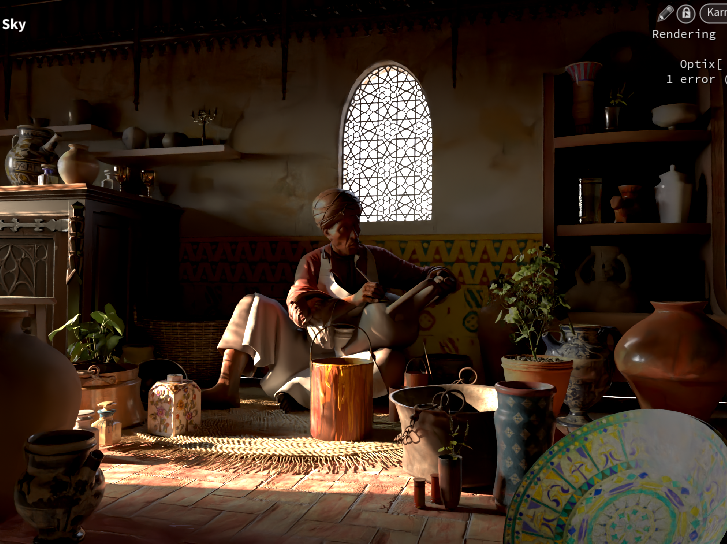
To fix this, I created a portal light. It was really easy to set up using the geometry settings node in Solaris. I also added the lamp to light the area on the frame left. The scene became very warm and nice. Additional tossing of the geometry helped the viewer’s eye to navigate through it. You can also notice a very fine layer of dust in the air, it’s especially visible on the frame left under the god rays. It added more realism to the scene and also tinted the entire image in a nice warm orange color.
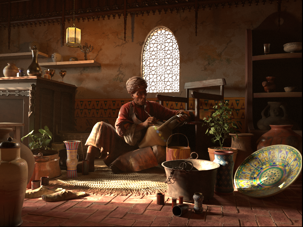
But for the final touches, I decided to lower the amount of lantern light and change the angle of the main sunlight to cover more of the plates to the right of the frame. Also, the window was screaming too much attention to itself, so I decided to change it too. I added a wall behind it to mimic the outskirts of the streets/back alley. To make objects in the foreground to be in shadow, I built a grid to block some of the sunlight. And just like this, with some extra tweak from the camera lens shader, I reached the final look!
Compositing
To alter the lighting and have more control, you can use COP network. Firstly, I created a bright node for each of the light AOV and combined volume AOV. After that, I’m combining all the light AOV with a custom-made add node. It uses a simple python code to add multiple layers together.
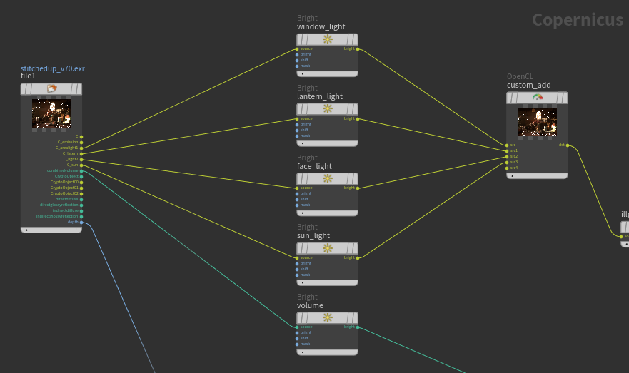
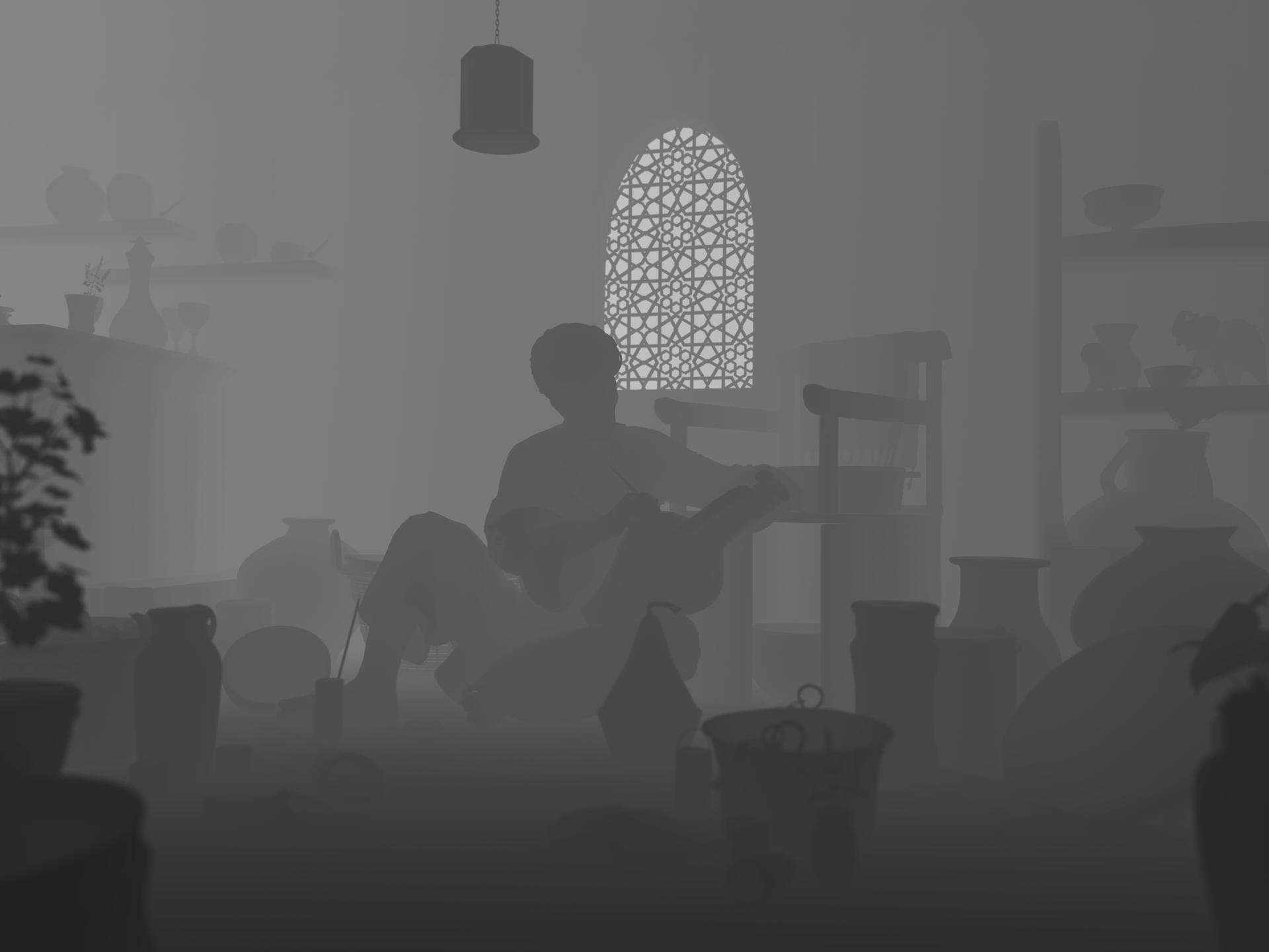
After I used depth map AOV to the darker foreground and background of the image. I remapped the depth map to have fg and bg in black. After I combined those layers, blurred them and added them to the image. You can see how it affected the result:
After adding some denoising, here is the result that I got:
Alternative USD path
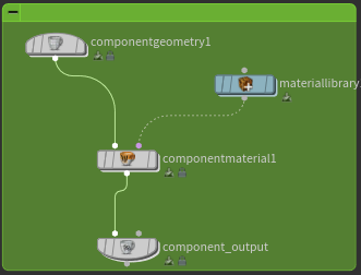
Because Solaris is USD-based, it is much better to have all assets exported seperatly in .usd. You can do it easily with Component Builder node.
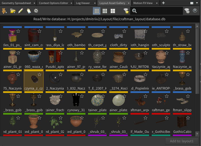
Component Builder will automatically create this chain of nodes. Inside of componentgeometry1 node, you can import your geometry and specify it to be render or proxy geo. It's very helpful to reduce a load on your machine while being in the viewport and not rendering. I imported each asset inside of it and assigned corresponding material to it. After that, in the component_output node, you can export your asset in USD format to disk. After that, you could add them to the digital asset gallery. They will appear in the Layout Asset Gallery tab.
Layout Asset Gallery will give you access to all your saved assets. You can easily drag and drop to add assets to the scene. It will create a reference node and plug a path to desired file to it.
Extra Tips and Notes
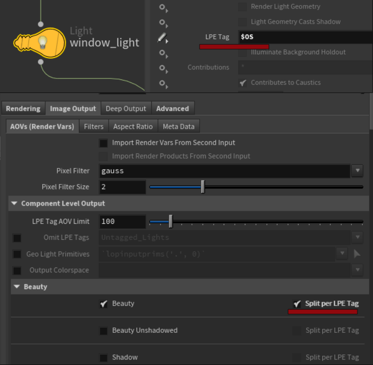
For the final render, it’s nice to have LPE tagging enabled. You can simply put $OS in the LPE tag section for each light and then check split per LPE tag at karma render settings node. It will help you to have manual control of brightness per light. You would be able to alter the scene to your liking!
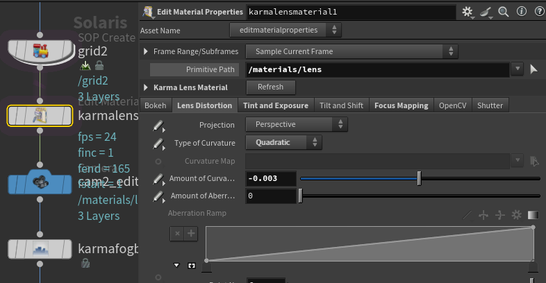
Using new and improved karma lens material will help you to reach a better look. Real-life lenses always have some imperfections. Adding curvature, altering chromatic aberration, and sparkling some vignetting and DOF will make a drastic change to the overall perception of the render.
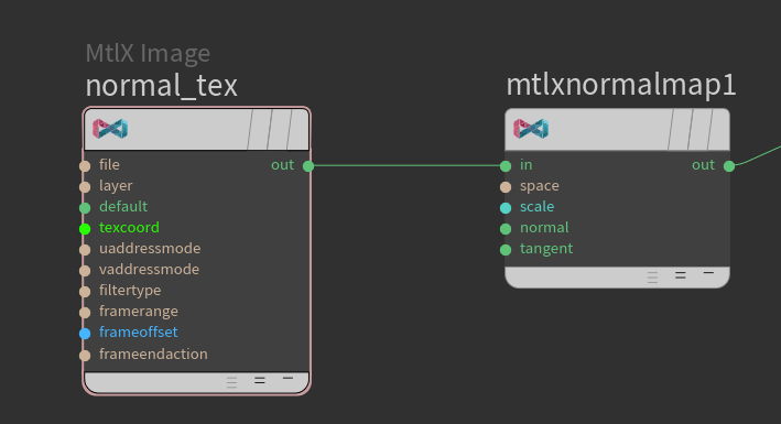
Karma expects normal map vectors to be in the range from -1 to 1 (signed). But most of the normal maps are offset (being 0 to 1 in values). To handle that issue always use mtlx normal map in your karma material builder network. It will automatically remap the values and your shaders will look correct.
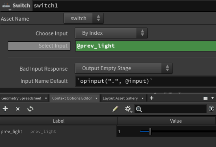
If you have switches in your LOP network, you can set up sliders to change them in one place using Context Options Editor. To access it, click on plus sign and find it under Solaris tab. When open, by clicking the plus sign, you will see a drop-down menu with a bunch of options. You can create Int Slider, it will be populated in the window. After naming it, you can access the value of that slider by referring to the name through @. It is very handy to optimize workflow and create takes.
Don't be afraid of using fake lights! In my scene, half of the lights are fake. One is to add more highlights to the face of the craftsman and another one is for the window. Be creative and draw the render with your lights!
CREATED BY

COMMENTS
Natsu 3 weeks, 6 days ago |
Thank you for sharing your project!
When I opened the scene file, I get the following error log, and couldn't see anything.
========================================
Load warnings for F:/HoudiniProjects/craftman_layout/craftman_scene_layout.hip
Warning:
/img/copnet1/topnet1/hqueuescheduler1:
Skipping unrecognized parameter "folder4".
Skipping unrecognized parameter "submitjobassign".
Skipping unrecognized parameter "submitjobclients".
Skipping unrecognized parameter "submitjobselectclients".
Skipping unrecognized parameter "submitjobgroups".
Skipping unrecognized parameter "submitjobselectgroups".
Skipping unrecognized parameter "submitjobsetcpus".
Skipping unrecognized parameter "submitjobcpus".
/img/copnet2/topnet1/hqueuescheduler1:
Skipping unrecognized parameter "folder4".
Skipping unrecognized parameter "submitjobassign".
Skipping unrecognized parameter "submitjobclients".
Skipping unrecognized parameter "submitjobselectclients".
Skipping unrecognized parameter "submitjobgroups".
Skipping unrecognized parameter "submitjobselectgroups".
Skipping unrecognized parameter "submitjobsetcpus".
Skipping unrecognized parameter "submitjobcpus".
========================================
I'm quite new to Houdini.
Is there something that I need to do to see objects?
Please log in to leave a comment.