Why is the UI Design of Houdini So Inconsistent?
13132 81 3-
- wanglifu
- Member
- 186 posts
- Joined: Feb. 2017
- Online
The newly designed node info panel in H20.5 and the previously introduced render status panel both look modern and appealing, which shows that SideFX has the aesthetic sense and capability to create good designs. But why do so many parts of Houdini still look so outdated and unattractive? The multi-colored icons and the 90s-style design elements are everywhere.
Why can't SideFX invest some resources and time to make the entire software look more modern? Isn't this important at all for attracting new users?
Why can't SideFX invest some resources and time to make the entire software look more modern? Isn't this important at all for attracting new users?
-
- isamarsh
- Member
- 12 posts
- Joined: March 2017
- Offline
-
- RGaal
- Member
- 143 posts
- Joined: June 2024
- Offline
-
- eikonoklastes
- Member
- 396 posts
- Joined: April 2018
- Online
I'll take a functional UI over a pretty UI any day, and Houdini's UI and icon design is extremely functional.
"Modern UIs" favour flat, uniform colour schemes and homogenised icon shapes,and they sacrifice immediate recognition in favour of marketable screenshots.
SideFX can definitely do some work to improve the look of the UI without sacrificing readability (and from things like the new info dialogue, it's clear that they are), and I'd rather they take that slow, measured approach to sprucing things up.
-

- ikoon
- Member
- 211 posts
- Joined: Jan. 2016
- Offline
I would like to take this opportunity to thank developers for using colors in many places because they have meaning and increase the clarity of the UI (to find something quick at the first sight). I also appreciate that the UI is not too flat, because using gradients in the right places also increases clarity ... same reason, to see the state (one of many states) of an UI element at the first sight (one of them being with 90's gradient is really good, why not). And of course thanks for constant improvement of the UI and UX, which is really great I think.
I attach an example of different colors (different states) of the Parm. There are probably even more colors/states and all have its importance and reason for an experienced user (it is an older image, I believe there was yellowish for a Parm with a function but without keyframe, there is also dotted outline for an evaluated expression/python/...).
I attach an example of different colors (different states) of the Parm. There are probably even more colors/states and all have its importance and reason for an experienced user (it is an older image, I believe there was yellowish for a Parm with a function but without keyframe, there is also dotted outline for an evaluated expression/python/...).
Edited by ikoon - July 10, 2024 08:22:03
-
- raincole
- Member
- 539 posts
- Joined: Aug. 2019
- Offline
-

- Mike_A
- Member
- 281 posts
- Joined: Aug. 2018
- Offline
-
- Jorge Ivanovich2
- Member
- 14 posts
- Joined: Aug. 2015
- Offline
-
- kodra
- Member
- 373 posts
- Joined: June 2023
- Offline
isamarsh
You want it to be more like Blender, where they change UI elements and hotkeys every few versions and everyone is left confused ?
These are the some exact words from SideFX support:
However, the hotkey system has completely changed for Houdini 20.5.
You will likely need to recreate your hotkeys.
At least Blender let me import from the previous version.
The irony lol.
Edited by kodra - July 10, 2024 15:12:56
-
- RGaal
- Member
- 143 posts
- Joined: June 2024
- Offline
-

- khomatech
- Member
- 16 posts
- Joined: Jan. 2022
- Offline
-
- LukeP
- Member
- 374 posts
- Joined: March 2009
- Offline
I honestly think that it’s gotten even more inconsistent with 20.5 unfortunately, as great of a release as it is… the MMB panel looks completely different than the rest of the software. The panels in Animation Context in APEX also look completely different from everything else… Not the biggest concern for me, but it is fairly inconsistent.
-
- Heileif
- Member
- 183 posts
- Joined: Jan. 2015
- Offline
-

- alexeyvanzhula1984
- Member
- 88 posts
- Joined: Nov. 2023
- Offline
-
- Heileif
- Member
- 183 posts
- Joined: Jan. 2015
- Offline
-

- alexeyvanzhula1984
- Member
- 88 posts
- Joined: Nov. 2023
- Offline
-

- alexeyvanzhula1984
- Member
- 88 posts
- Joined: Nov. 2023
- Offline
-
- kodra
- Member
- 373 posts
- Joined: June 2023
- Offline
Well, yes, I agree. These icons can use some more "design language".
They're well drawn, but with no design language.
For example:
This is PolyBridge:

Notice that the existing geometry is blue, and the newly created geometry is yellow. Let's assume this is a good design.
This is PolyBevel:

See the problem? If "existing = blue, new = yellow" is a good guideline, then all the poly modeling tool icons should follow it. It's not about whether "existing = blue, new = yellow" is good or not. It's especially NOT about whether a icon should be flat or monochromatic. It's about consistency across the same category of tool.
That's what is called design language and what Houdini generally lacks for.
They're well drawn, but with no design language.
For example:
This is PolyBridge:
Notice that the existing geometry is blue, and the newly created geometry is yellow. Let's assume this is a good design.
This is PolyBevel:
See the problem? If "existing = blue, new = yellow" is a good guideline, then all the poly modeling tool icons should follow it. It's not about whether "existing = blue, new = yellow" is good or not. It's especially NOT about whether a icon should be flat or monochromatic. It's about consistency across the same category of tool.
That's what is called design language and what Houdini generally lacks for.
Edited by kodra - July 14, 2024 12:27:42
-

- oldteapot7
- Member
- 111 posts
- Joined: Jan. 2018
- Offline
I did some investigation. The main problem is that Houdini Icons are generated on fly from vector files (SVG). It means that those icons can be scaled to 4k monitor or other custom resolution without problems BUT it also means that its very hard to design icons in corelation to each other.
Good designs require optical corrections like fe. kerning in fonts to make them better for clarity wich means easier for eyes that can affect reading times (or working times with houdini)
From programming point of view its clever idea but its very hard to make it look good since UI is made from "boxes" that are filled with bitmaps.
And thats why parameter pane looks so bad for artist but people without sense of escetics find it "functional" LOL
UI both can be functional and well designed.
My guess why it havnt changed for 15 plus years is that there are many tutorials and learning materials and changing UI might make them useless in opinion of some ppl..
But theres solution. Why not make 2 UI?
1 for old forks with already existing muscle memory
And 2nd one for artist that want to switch from MAYA, MAX and all other.
There were two vieport versions: OpenCL and Vulcan in beta. Why it cant be done for UI?
BTW. illustriation like icons are good for nodes, but for main menu, parameter pane and animation pane its too detailed.
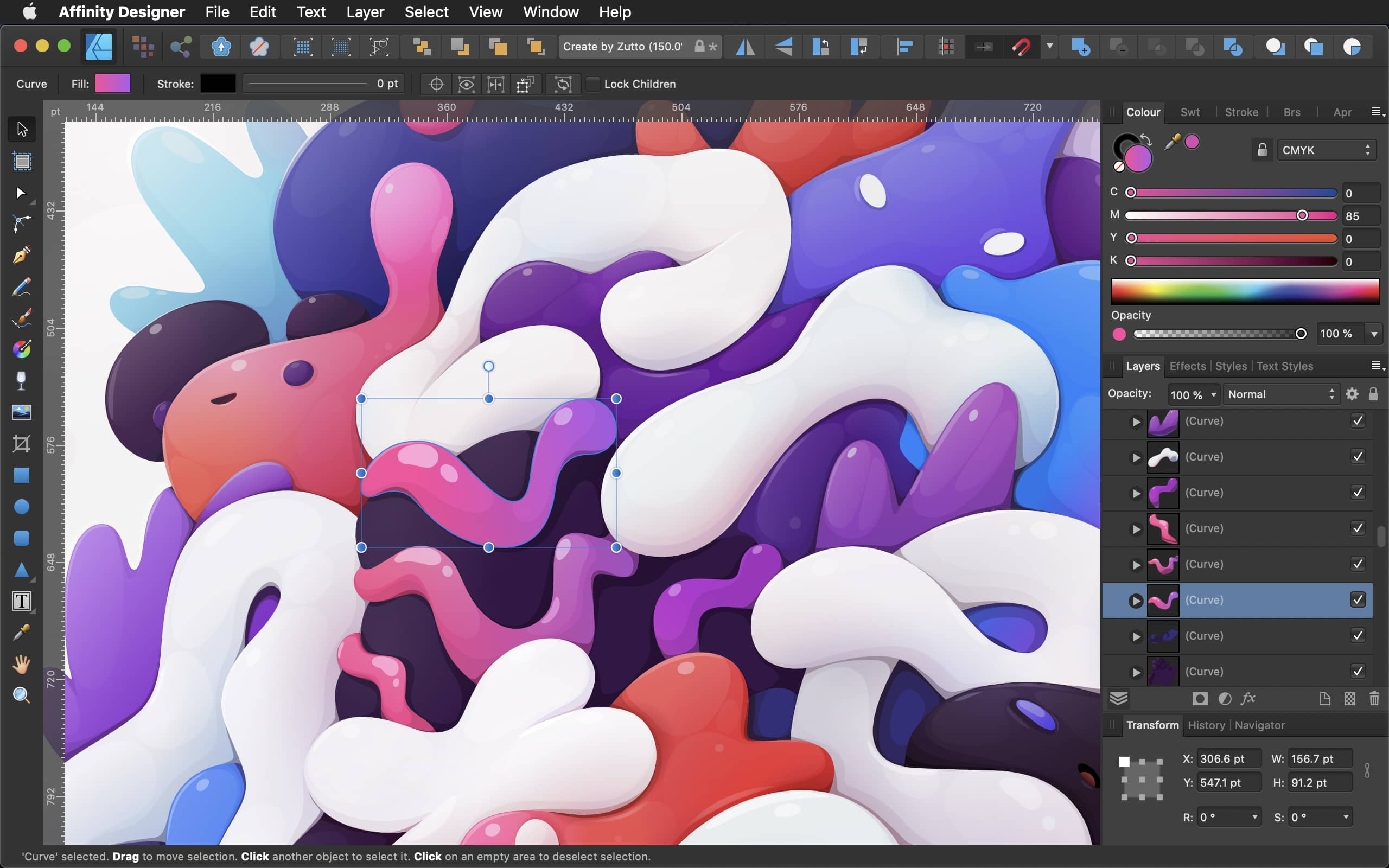
Btw just look at Affinity designer ICONs thay match both worlds i guess:
.

Edited by oldteapot7 - July 15, 2024 03:49:35
-
- eikonoklastes
- Member
- 396 posts
- Joined: April 2018
- Online
oldteapot7
I did some investigation. The main problem is that Houdini Icons are generated on fly from vector files (SVG). It means that those icons can be scaled to 4k monitor or other custom resolution without problems BUT it also means that its very hard to design icons in corelation to each other.
I'm not sure what your investigation sources were, but there's no general restriction with designing with SVG; it's just a vector format. You can design your icons in any vector illustration app that has an SVG export option, and write out your SVGs from there.
The only issue I've seen with SVGs is that they lose precision at very small scales, so you have to design to a minimum size (but that issue does not apply here).
oldteapot7
parameter pane looks so bad for artist but people without sense of escetics find it "functional" LOL
I'm not sure what the need to get confrontational was, but I didn't see anyone in here (including me, who this comment is clearly aimed at) make a case for preferring function-only UIs without any sense of aesthetics. The position is to prefer the state of things as they are, rather than sacrifice functionality on the altar of beauty.
If SideFX can do both, then more power to them. They're trying, and the new node info dialogue is a promising step towards that, but there's a post somewhere here that shows that group names are truncated [www.sidefx.com], so you cannot actually read them, which is the perfect example of breaking functionality in favour of a better-looking UI.
To drive home the point, I'd take the older, uglier UI any day over the more useless, prettier new UI, but I still hope that the UI can be pretty and functional, and I'm happy to let SideFX take their sweet time over it. I hope that's clear now.
-
- Quick Links


